Showing posts with label Drawing. Show all posts

Tuesday, 18 June 2013

Designing a Debaucherous Duo: Harold Pinter's The Lover (Part 3)

Oh boy, finally getting back into the swing of things, and all I'm doing is bombarding you with all this design bunk, huh? Well too bad, because this show is the only thing on my mind right now!! Also all my sketches are currently on my work computer, which is imminently being replaced, so I need to write these posts and empty out my personal files.

Today's topic: Prelim Designs, or, How I Learned to Stop Worrying and Love My Ugly Sketches.

So, you've talked to the director, you have some kind of psychologically driven concept for the show, you have this huge stack of research, and now what? Prelims.  Now it's time to take all that research and turn it into loose quick sketches for each costume.  Everyone's approach to this is a little different.  Some people may want to create sort of "mood boards" (oooo) of colours and textures for each character, to help keep a consistent thread and track the visual development of the character throughout the story.  Some people may do a similar thing with a giant list of words.  Other people still don't write any of this shit down, and just internalize it.  I'm more of the latter party.  "I've read this one act play 6 times, if I don't get it now, I am never going to".  

You know who the characters are, what their individual experience of the story is, and have some idea how that needs to translate to their "look" in the show.  Now, pick up a pencil, and draw.  The key to prelims is don't be too precious about them, and don't let them take a long time.  You may even draw multiple versions of one look, if you think you and your director have different visions, or you're still working some details out in your head.  Just draw a bunch, and then select the sketches you're going to show your director which you feel best represents your vision for the show.  Your sketches may eb beautiful, or they may look like (to borrow a beloved phrase) hammered-ass, like mine.  Doesn't matter, just as long as the ideas get out there, I mean the director is going to ask you to change things anyway!

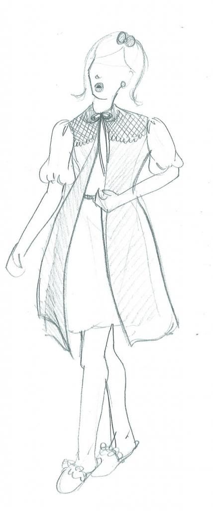
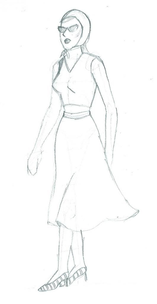
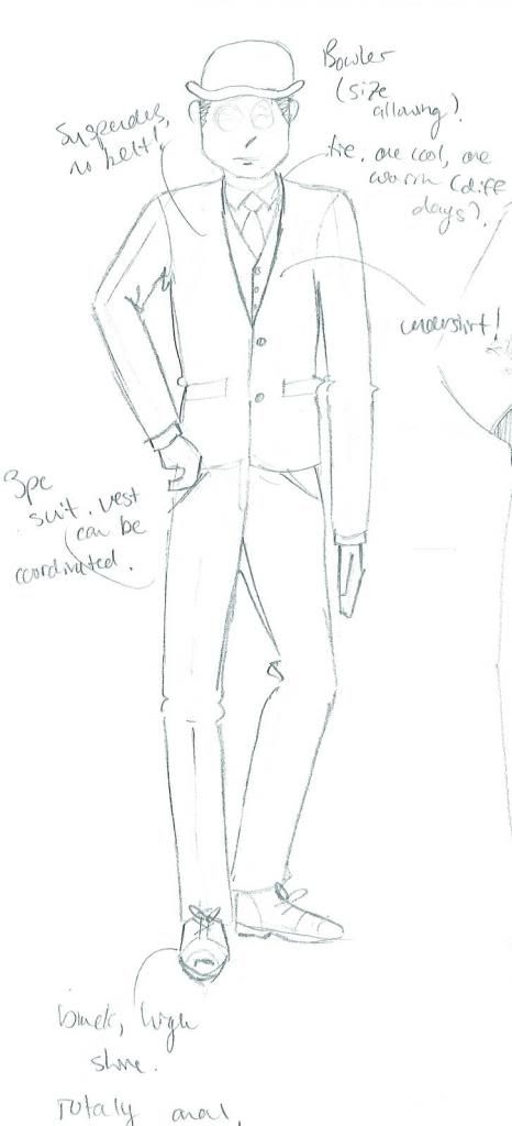
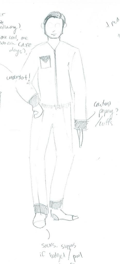
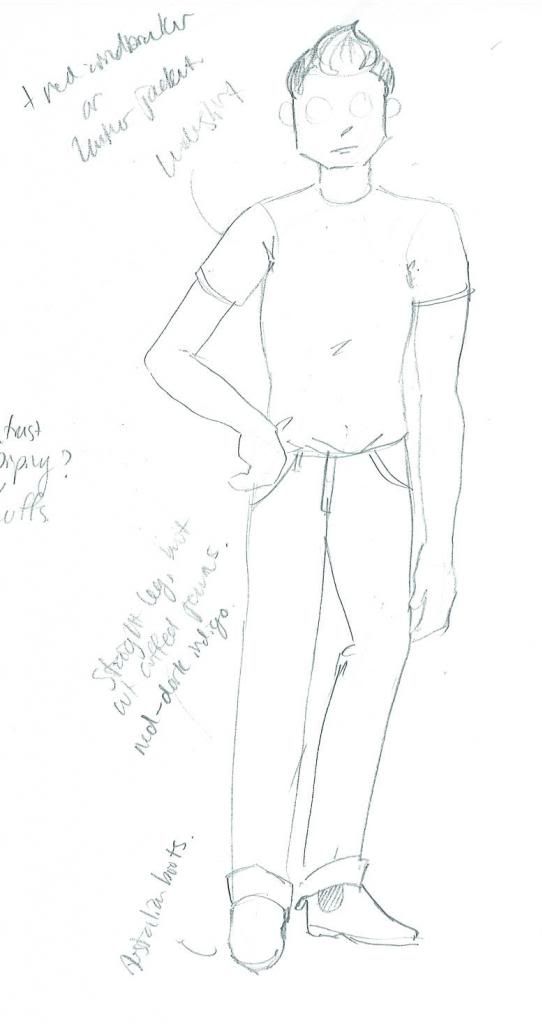
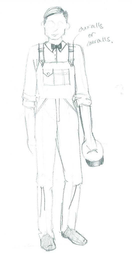
Here are my prelims for The Lover.  Please, try to stifle your laughter.  I should not be putting these on the internet and claiming to have any artistic ability, but I promise you these sketches are a tool, and are as quick and dirty as I get.  Deadlines, y'all.
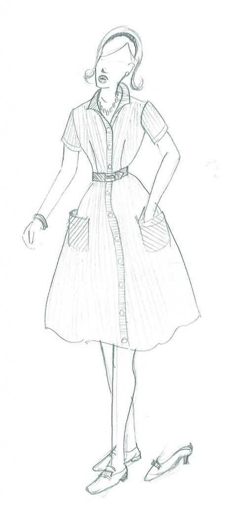
Sarah, look 1
Sarah, look 2
Sarah, look 3
Richard, look 1
Richard, look 2
Max
John, The Milkman
Next time, I'll be sharing my final designs for The Lover.  I promise, they are way prettier.  You won't believe all the things that changed!! Prelims really are a tool of communication, as all artwork for theatre is.  It may be beautiful, or it may be sloppy, it may be realistic or it may be abstract; the renderings a designer does need only do one thing really well: show the people responsible for making the show what it is that they want.  But more on that next time!

--Erin

Tuesday, 7 May 2013

Life Drawing (Very Nude)

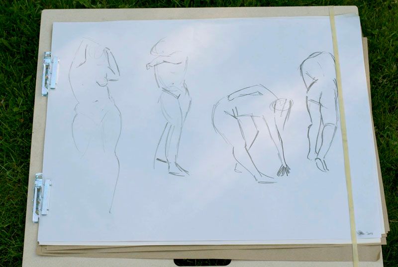
1 minute gestures from week 2.  Gesture drawings are a quick representation of the movement of the body.  Every artist does these TOTALLY differently.  Some people draw squiggles, or cage like forms of the body.  You do these first to loosen up, and get used to looking at the body as a complete unit capable of so many different angles that play off each other. Claw/noodle hands optional (unless you're me). 


One of my biggest goals for this year was to start taking life drawing classes again.  I did life drawing classes as a degree requirement for a few years in University, but otherwise did not pursue life drawing as a hobby and devoted practice time outside of my studies.  This is something I really wanted to change, as my rendering style as a costume designer is something that I find really important, and can be a great opportunity to express your individual aesthetic as a designer.  And, well, you have to know what the human body looks like, if you're going to design clothes for it (and then try to draw the whole thing so someone else can build it!).  This is why drawing naked people for a few hours every week is a good idea.  Plus it's incredibly relaxing and fun.  I've been taking a drop in life drawing class for about 5 or 6 weeks now (not counting the ones where I didn't make it to class), and I've already seen quite a bit of improvement.  Here are my favourite works from each session.  
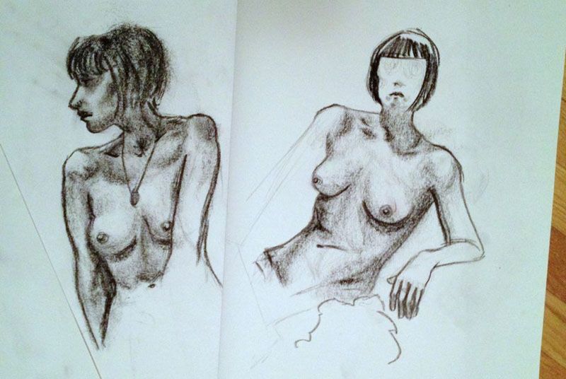
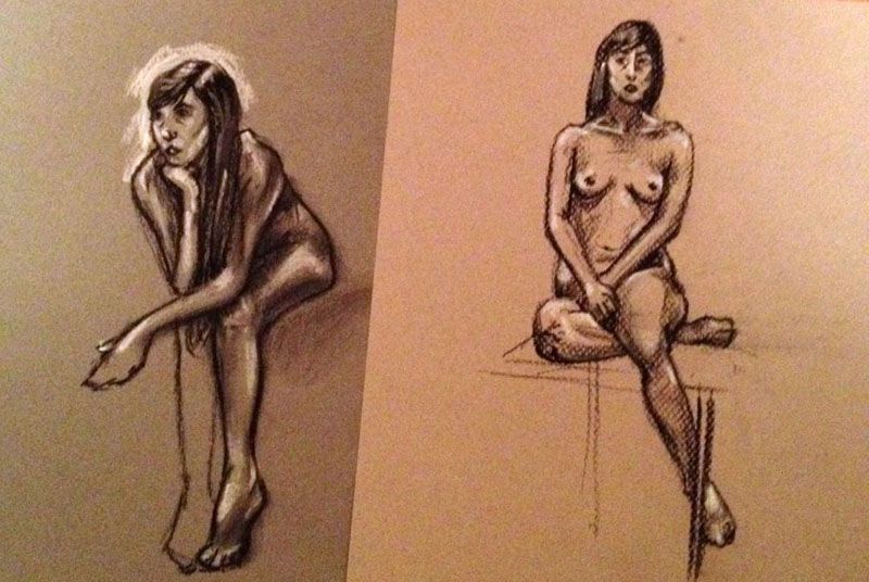
Week 1// conte crayon and newsprint.  I enjoy drawing breasts from real life, because the light and shadow has to be just right to express fullness.  Most women's breasts are not perfectly identical, and capturing this, or the way the pose changes the breasts (such as the pose on the left) is really tricky. 
Week 2// Conte crayon, chalk and grey pastel paper in 2 shades.  Sometimes your model is a fidget, and you end up drawing their hands and feet and flippers because the moment you go to flesh them out, they start moving the part you're focusing on.  True story.  #lifedrawingproblems
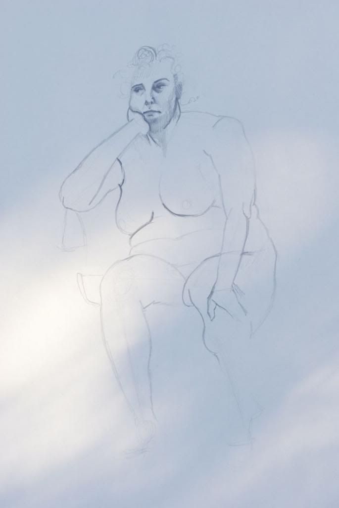
Week 3// Pencil and Newsprint.  I have always loved the illustrative style of comic books, but never really had a handle on doing shading in such a graphic way.  I tried to approach the drawings with this in mind, this week.  Also I find drawing eyes difficult, especially from observation.  Is it just me, or do the models tend to look around a LOT? 90% of the time I end up with something vaguely crosseyed.  It's so much worse if the face is at 45', Anything beyond the nose is constantly shifting!
Week 3// Pencil and Newsprint.  I likewise tried line as expressively as possible, to imply depth without shading and additional contouring.  I am not by instinct a minimalist, which makes cartooning and water colour very difficult mediums for me.
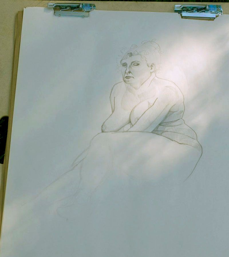
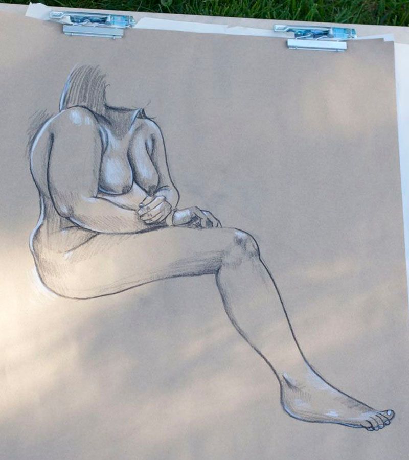
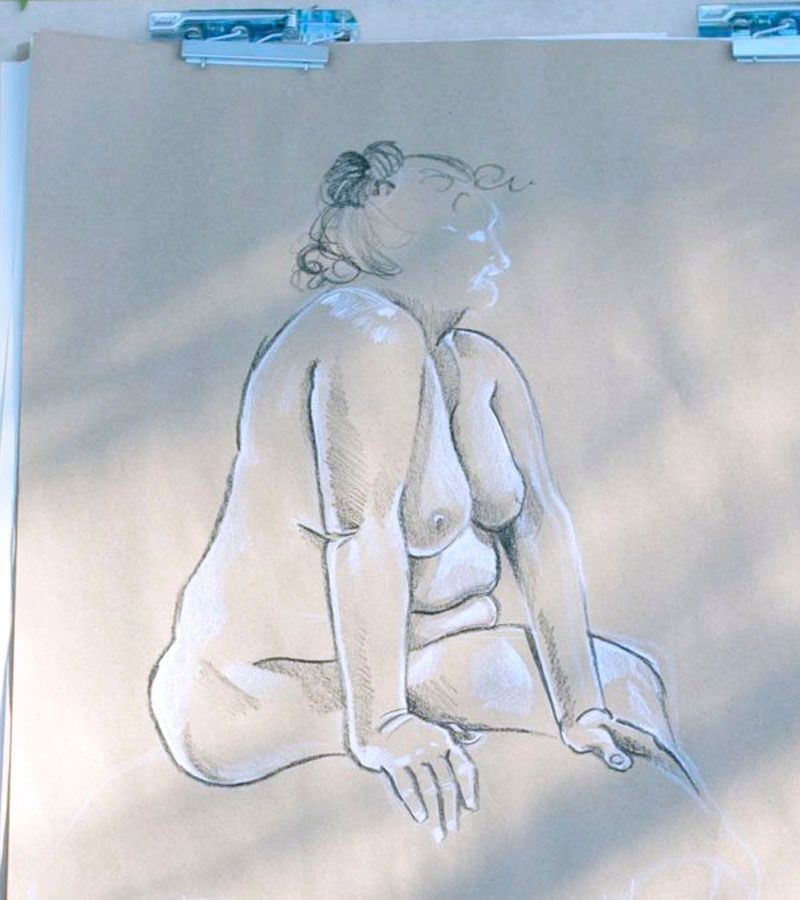
Week 4// black and white charcoal pencils and kraft paper.  After the success from my experiment drawing highlights and shadows on coloured paper, I picked up some charcoal pencils and large format kraft paper while in Toronto.  Living in a region with no dedicated arts supply store makes classes like this difficult, and I have to stock up before things become dire. 
The first couple weeks of this class I tried to focus on using different mediums, to find something I really enjoyed working with.  I knew from university that I liked conte crayons, but I found quickly that I was trading exactness and detail for quick brushy shadows a little too much for my liking.  Then after that I discovered how much I LOVE being able to put in highlights, by using chalk on a coloured paper.  I found that working off a "medium" tone instead of the bright white (or close, haha) of newsprint, made me feel I could push my shadows more, and really sculpt the body.  So far so good! I had some old charcoal pencils hidden away in my drafting table at home from a kit a friend gave me years ago, and loved the balance of control, fluidity and tone: being able to buy something in "light" "medium" and "dark" made laying out blocky shapes and continually refining really easy and less stressful if I made a mistake.  I do not use an eraser for life drawing, so if it's a dark line, it's there to stay.  And suddenly, your drawing has 3 arms...oops!
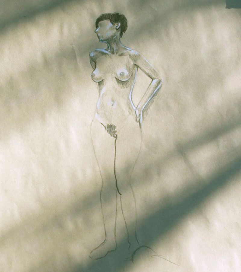
Week 5// Blacka nd White Charcoal on Kraft paper.  This was the same model as the first week, with a sweet new haircut.  I immediately notice how much more balanced and connected her shoulders and clavicles look here, compared to the first class.  I still need to work on laying out my darkest darks first, as gradually building them takes too much time.  Even in a 20 minute pose like this, I don't get the whole figure fleshed out. 
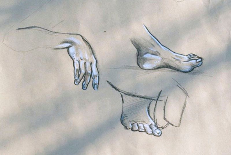
Week 6// Sometimes, a pose is too similar to be worthwhile, or I feel I'd get better practice working on something more specific.  Hands and feet are notoriously difficult, so I'm trying to dedicate more time to sketching just these from life.  I'm particularly happy with the foot on top.  The balance of light and shadow around the ankle gives the bone a crisp line, but indicates the fulness around it.  The model flexed her toes every time I tried to draw them.  It drove me nuts.
So far in this process I've been focusing more on accurately laying out the body and keeping things proportionate, than I have developing style.  I finally feel like I can start delving into that more, now.  As a challenge to myself, this week I tried to start a drawing not with the shadows, but with the light.  I think that because there tend to be fewer stark highlights on the body, I find it easier to keep the distances between them more accurate, and I think it lead to my best life drawing to date (below).  I'm particularly happy about her right arm and bent wrist.  I think the weight resting on it looks plausible. 

Week 6// black and white china marker on kraft paper.  China marker is like the awesome freak-baby produced if oil pastels,  pencil crayons and permanent markers managed to spawn.  Glides beautifully over paper, makes it very easy to get bright brights and dark darks, but only offers a small range of responsiveness to pressure.  So, you can cross hatch, but traditional shading is out of the question.  But it makes you strangely bold to work with something so accepting of a heavy hand (like mine). 

Though I've only been doing life drawing regularly for about 2 months, I can already see how drawing the body from observation offers the greatest insight to how the body is constructed, and how this can inform any drawing of people outside of class.  I see this time helping me reach my own goals as an artist, with the incredible work I get to see every day motivating me to keep pushing myself and to try new things.  I can't wait to get a couple more sessions under my belt and then apply what I've learned to the 3 shows I will be designing this summer. I'll do another bulk update on life drawing in a couple months, but if you want to see what I'm up to, I instagram my favourite piece or two from each class (@efgerofsky)
Are there any skills you have been working on lately?  And any other artists in the house?
--Erin