Showing posts with label Costume Design. Show all posts

Friday, 16 August 2013

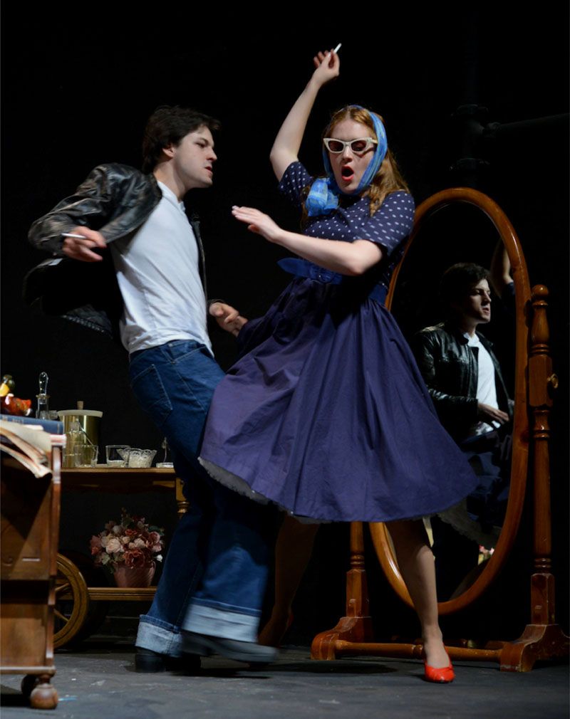
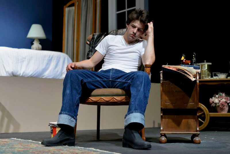
Designing a Debaucherous Duo: Part ?, Production Photos (IT'S OVER!!)

When you're working on a show, it can feel like you're neck deep in the thing 90% of the way through it.  At a point, just about before you go into tech week, you start feeling that work creep up a little higher around your mouth, and you think you're probably going to drown.  "Maybe the light at the end of the tunnel is that pre-death vision people get?" "When I die, what will happen to all my fabric?" Those kinds of thoughts are just the regular, when you work in theatre and life is always crazy.  You just kind of forget that there comes a time when it's over, when the stress breaks and you get to enjoy something for a quick moment before it's on to the next. 
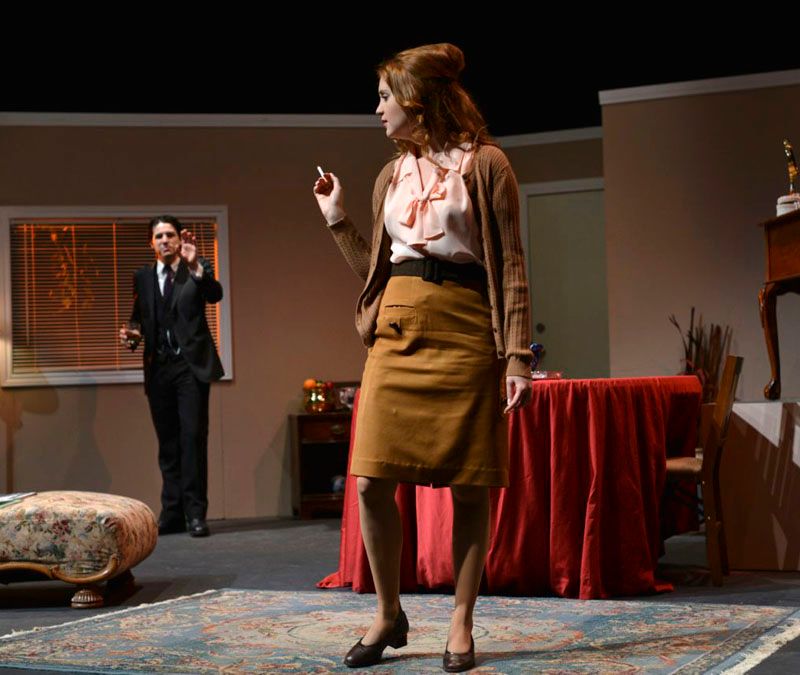
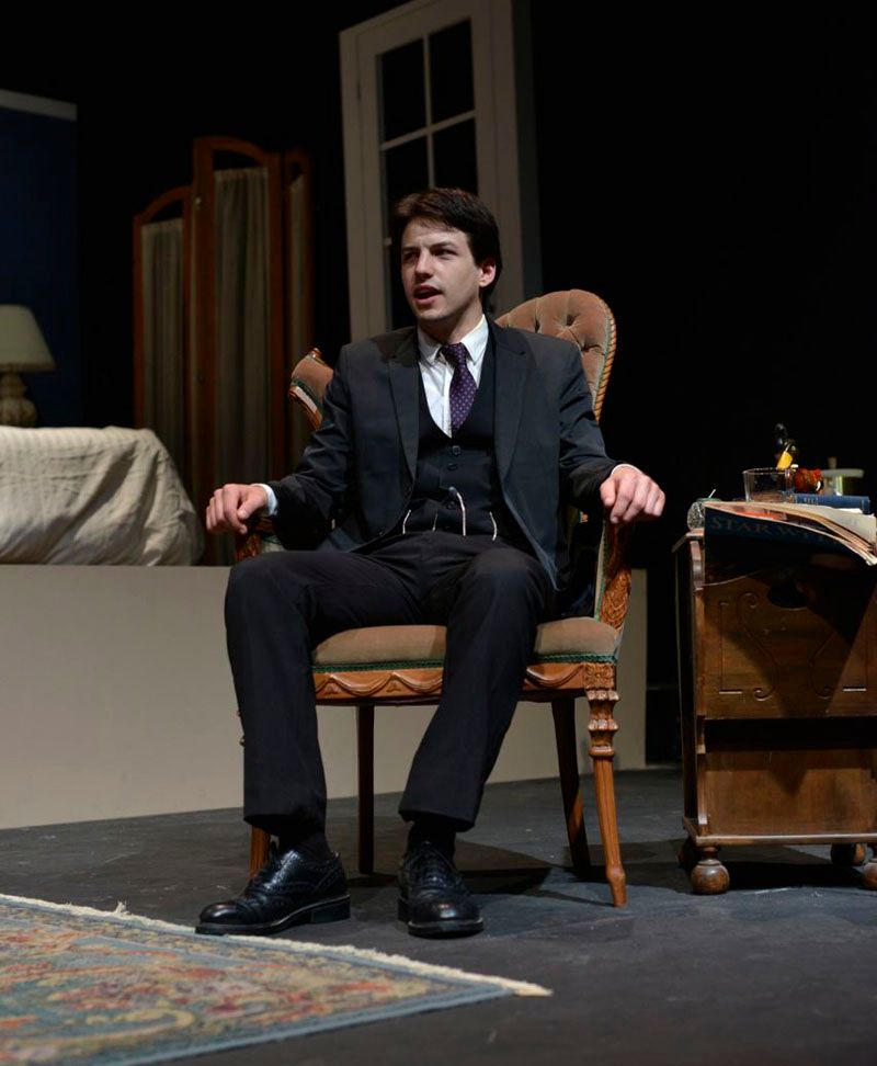
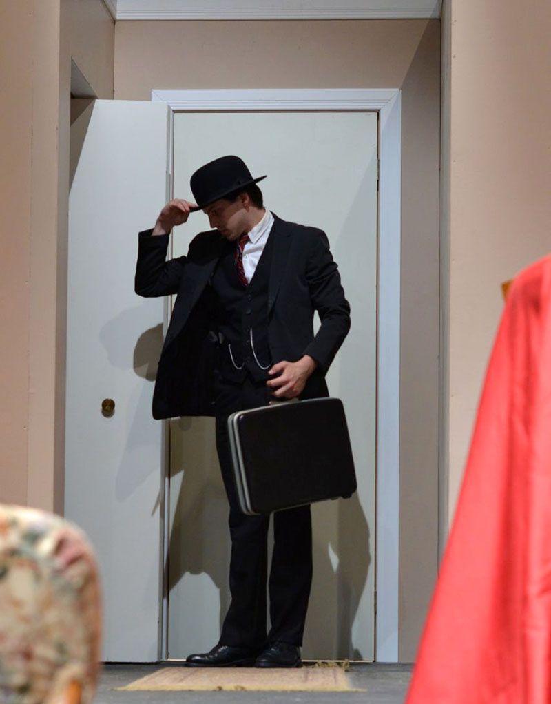
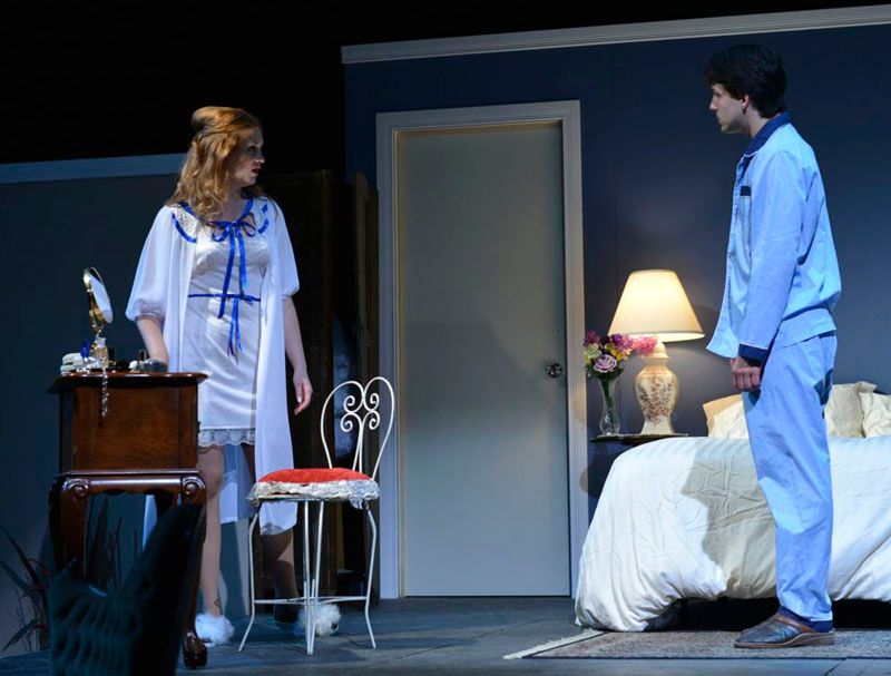
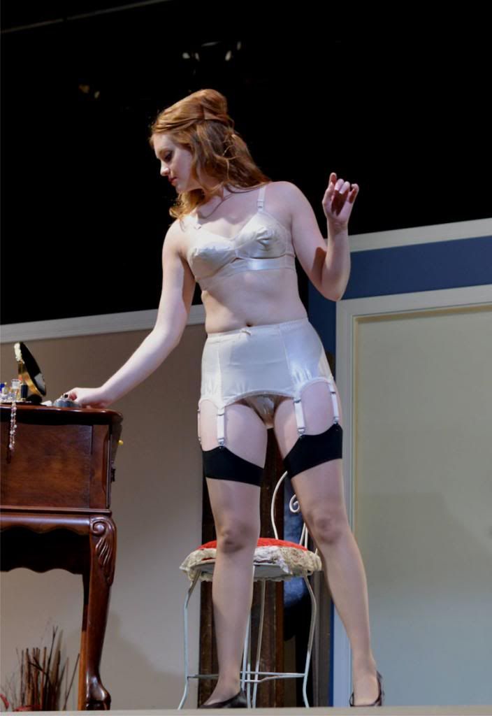
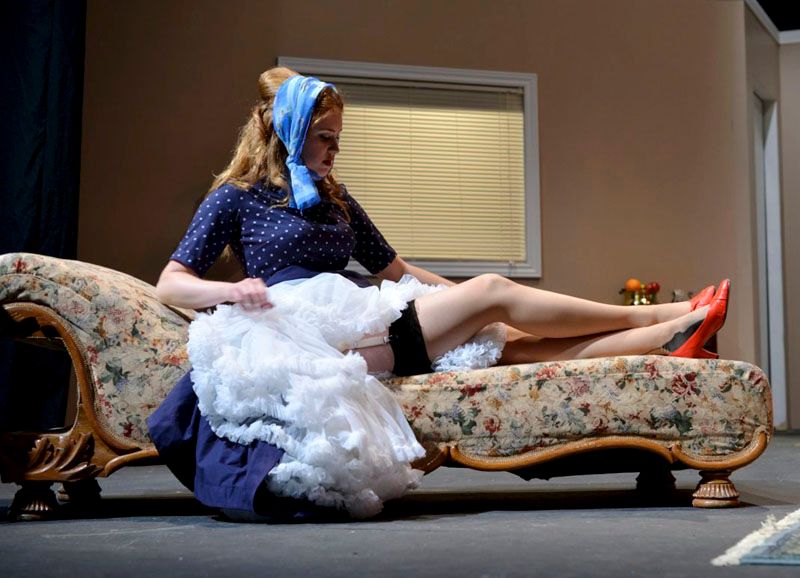
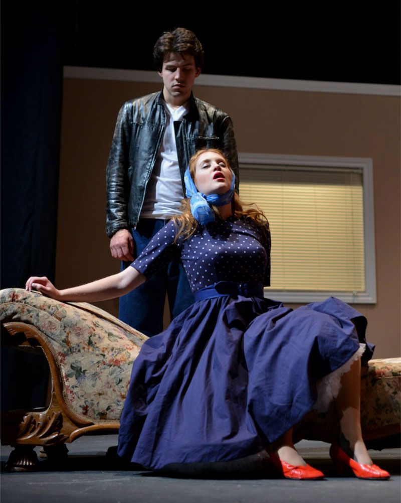
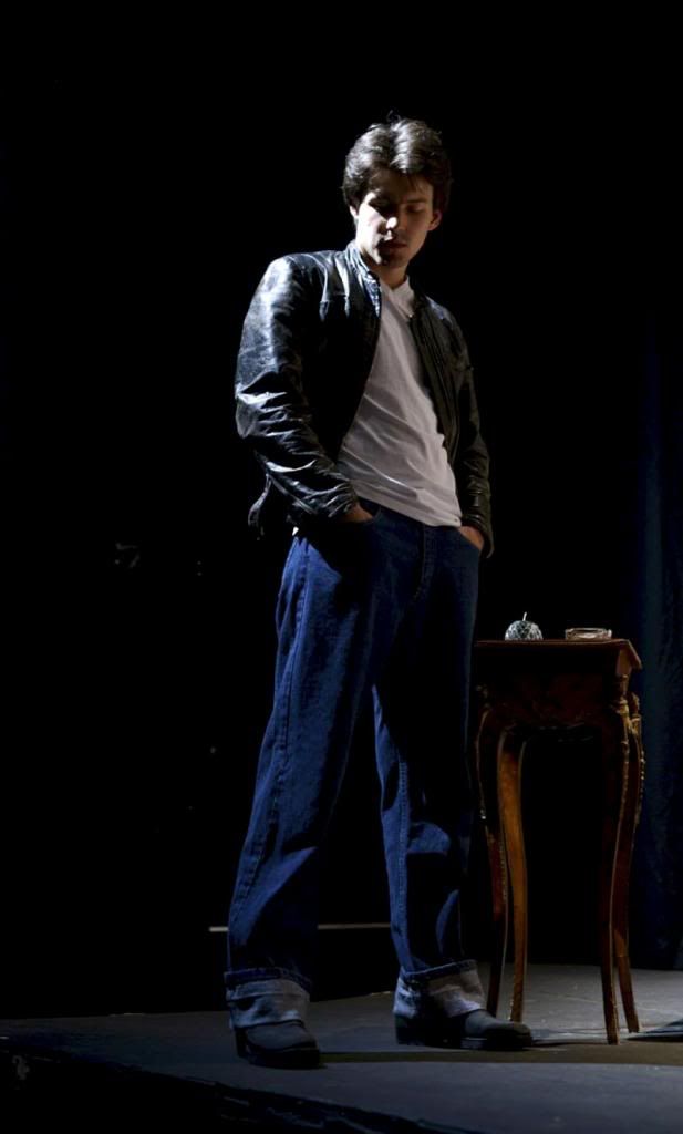
 Though I am already on to the next (I had a design presentation for two one act plays I am desiginng for the Shaw this week), the short short run for The Lover went fabulously well and opening night, rainy though it was, was a relief and surprisingly a joy.  And now... it's over.  all the costumes have gone back to their rental houses or on to new homes, and I'm back in Niagara-on-the-Lake.  But we always have the photos to remember the crazy times before it all settled down.  And with that, here are gratuitous photos of The Lover.
Nicole Buscema as Sarah, Stephan Ermel as Richard/Max, Ed Hillier as John, Directed by Peter Wylde.  Set Design by Michelle Ramalho, Costume Design by Erin Gerofsky, Lighting Design by George Quan.  Photography by Erin Gerofsky.


A big thank you again to all who worked on the show, and everyone who came out to support it! We had some strong responses from Mooney on Theatre and NOW Magazine (for all you Torontonians), and I sincerely hope it isn't my last project with Three Peasant's Theatre.  Good thing the Artistic Director and I go way back, hah!

--Erin

Friday, 21 June 2013

Designing a Debaucherous Duo: Harold Pinter's The Lover (Part 4)

Drum roll, please....

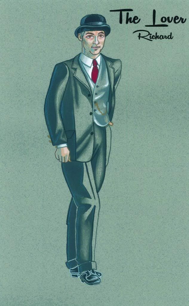
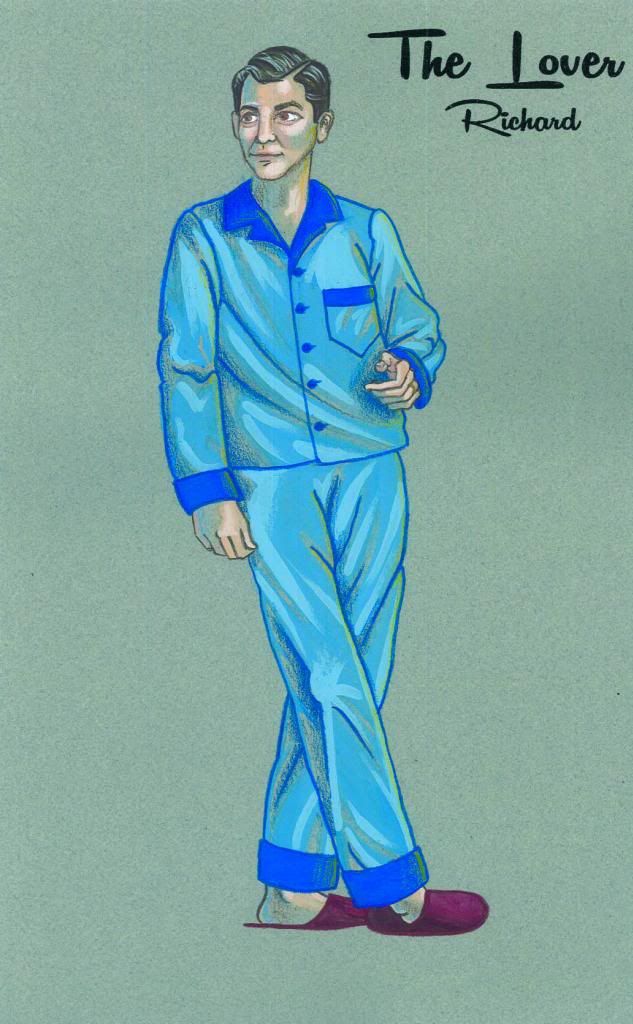
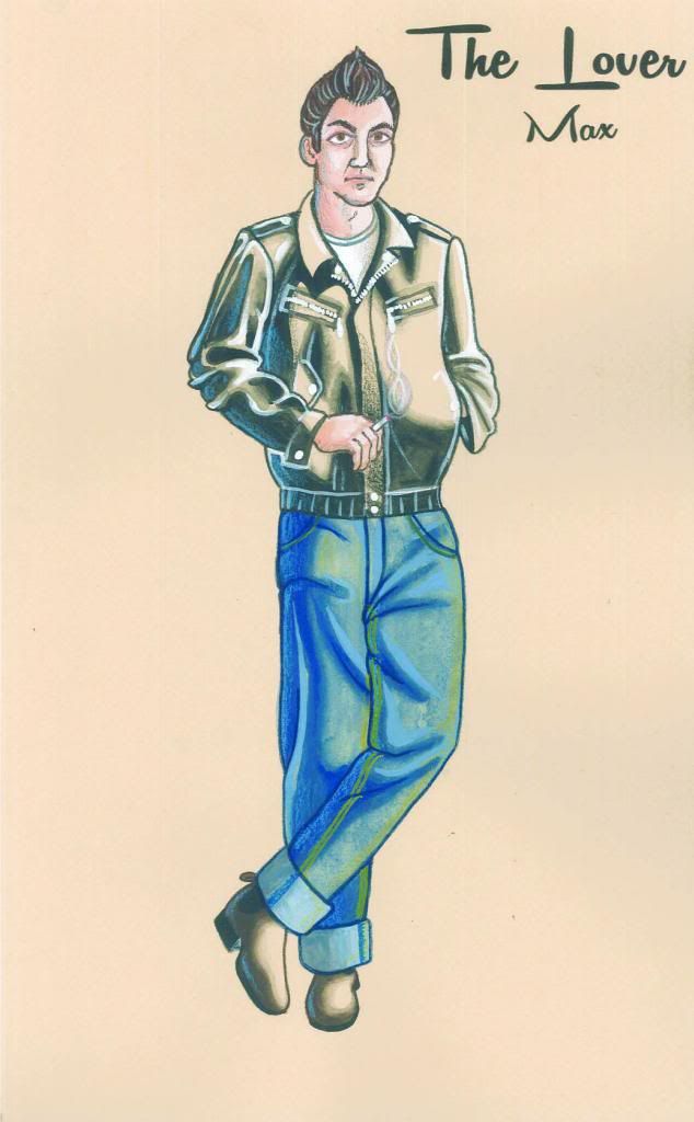
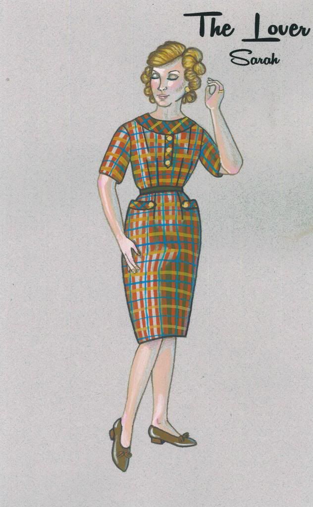
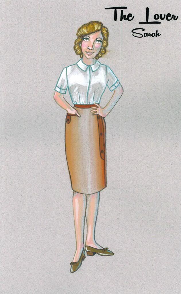
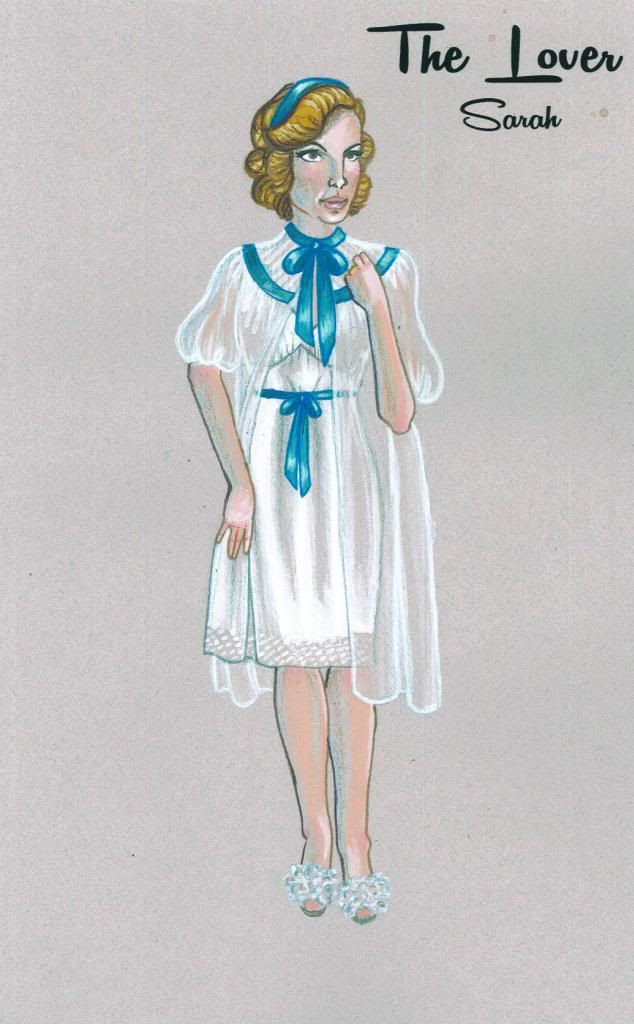
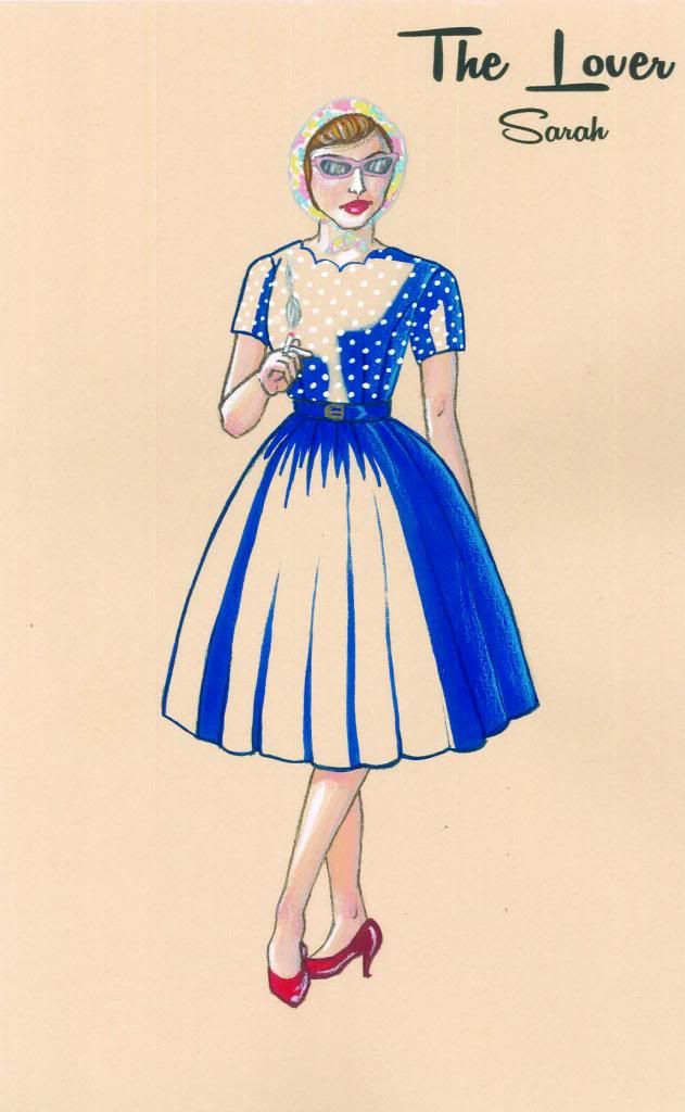
Aww yiss, it's finals time! All my finals were completed for a final design meeting last weekend, at which time they were all completely approved.  And let me tell you: feels good, man!  These renderings were all done in gouache, which if you're unfamiliar with it is a paint that is like if acrylic and watercolour paints came together to produce a perfect, freaky-deaky hybrid.  It can create solid colour (in a matte finish! unlike acrylic, which is quite shiny) and watery transparent washes, and is very often used by illustrators.  My brother bought me a set of gouache for the holidays (thanks Joe!) and this was my first big project with them.  I'm glad I didn't totally botch it! Details were added onto the paintings with pencil crayons (also got gifted some sweet Prismacolours for my birthday!), and the labels were printed onto the finished renderings.  You know what's more stressful than running a finished piece of art through a printer? Nothing. That part sucked.  But damn, do they look fancy! 

See if you can spot the (many!) changes between the prelims and the finished renderings.  That's why I stressed that prelims are quick: they're a way for you to communicate your idea to the director, and you can bet that they are going to have ideas to communicate right back.  Depending on your time constraints, you may go back and forth quite a bit.  As we only had 1 week between prelims and finals (yeah, these renderings are brought to you by Oreos and red wine) I had to take that information and make compromises and hope that I hit the money.  I did.  Now I just have to find everything I drew, and that is an entirely different battle!

Butcher Scanner wrecks white balance to the extreme.  This is as close to the originals as I could get them! The paper is grey-blue :)
Max is played by the same actor as Richard (and is, in fact, Richard in disguise!)
I've already been hitting the thrift stores hard this week to make our tiny budget stretch as much as possible, and I am so excited to get this show put together!  There are going to be some really fun and challenging sewing projects in my (near) future, and I'll be sure to share them with you guys here!  
 
--Erin

Tuesday, 18 June 2013

Designing a Debaucherous Duo: Harold Pinter's The Lover (Part 3)

Oh boy, finally getting back into the swing of things, and all I'm doing is bombarding you with all this design bunk, huh? Well too bad, because this show is the only thing on my mind right now!! Also all my sketches are currently on my work computer, which is imminently being replaced, so I need to write these posts and empty out my personal files.

Today's topic: Prelim Designs, or, How I Learned to Stop Worrying and Love My Ugly Sketches.

So, you've talked to the director, you have some kind of psychologically driven concept for the show, you have this huge stack of research, and now what? Prelims.  Now it's time to take all that research and turn it into loose quick sketches for each costume.  Everyone's approach to this is a little different.  Some people may want to create sort of "mood boards" (oooo) of colours and textures for each character, to help keep a consistent thread and track the visual development of the character throughout the story.  Some people may do a similar thing with a giant list of words.  Other people still don't write any of this shit down, and just internalize it.  I'm more of the latter party.  "I've read this one act play 6 times, if I don't get it now, I am never going to".  

You know who the characters are, what their individual experience of the story is, and have some idea how that needs to translate to their "look" in the show.  Now, pick up a pencil, and draw.  The key to prelims is don't be too precious about them, and don't let them take a long time.  You may even draw multiple versions of one look, if you think you and your director have different visions, or you're still working some details out in your head.  Just draw a bunch, and then select the sketches you're going to show your director which you feel best represents your vision for the show.  Your sketches may eb beautiful, or they may look like (to borrow a beloved phrase) hammered-ass, like mine.  Doesn't matter, just as long as the ideas get out there, I mean the director is going to ask you to change things anyway!

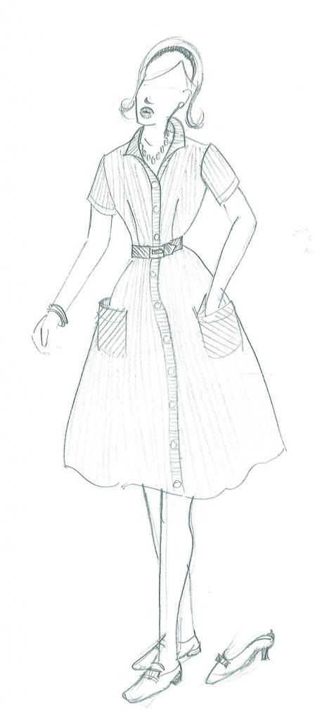
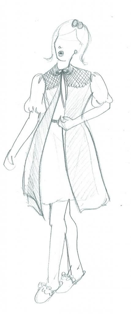
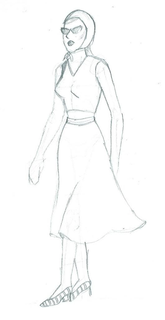
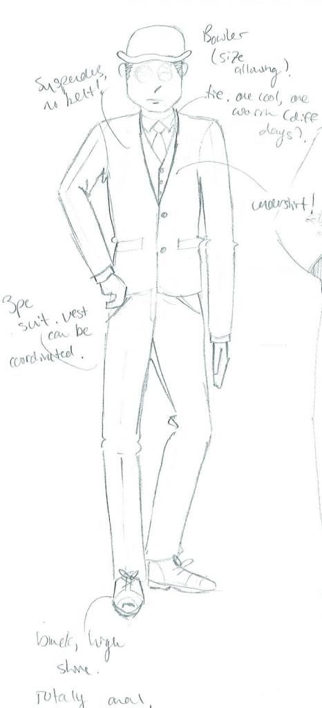
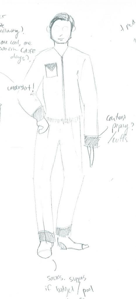
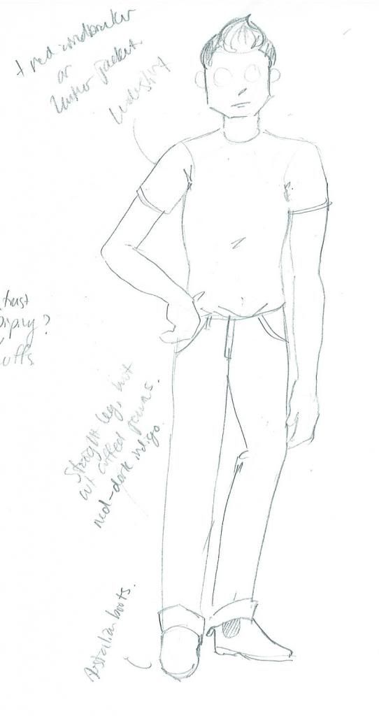
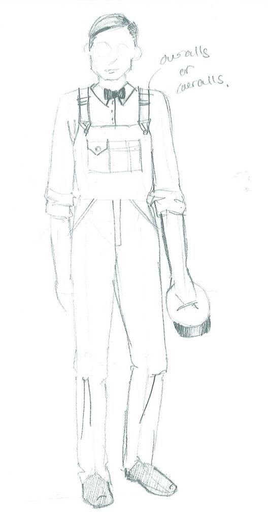
Here are my prelims for The Lover.  Please, try to stifle your laughter.  I should not be putting these on the internet and claiming to have any artistic ability, but I promise you these sketches are a tool, and are as quick and dirty as I get.  Deadlines, y'all.

Sarah, look 1
Sarah, look 2
Sarah, look 3
Richard, look 1
Richard, look 2
Max
John, The Milkman
Next time, I'll be sharing my final designs for The Lover.  I promise, they are way prettier.  You won't believe all the things that changed!! Prelims really are a tool of communication, as all artwork for theatre is.  It may be beautiful, or it may be sloppy, it may be realistic or it may be abstract; the renderings a designer does need only do one thing really well: show the people responsible for making the show what it is that they want.  But more on that next time!

--Erin

Monday, 17 June 2013

Designing a Debaucherous Duo: Harold Pinter's The Lover (Part 2)

Hi again sports fans!

It surely does feel good to have a moment to write here again.  The last two weeks have been a whirlwind, and I mean like a destructive "it's a twistah!!!" kind, not the fun-fancy bright lights and cotton candy kind.  12 hour work days were pretty regular.  And while it always feels good to be busy, that was really, really busy.  But now the final designs have been handed in and approved, and I can catch you all up in this behind-the-scenes look into my design process.

The other week we talked a lot about the play, and the political and social context of the time in which it was written, which is always important to consider when staging a production.  After all, theatre is a mirror of society, or some fancy-pants junk like that.  In this case, it really really is.  

Okay, so we know the where, the when, and the why of the play, now what does it look like?!

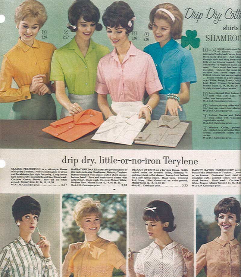
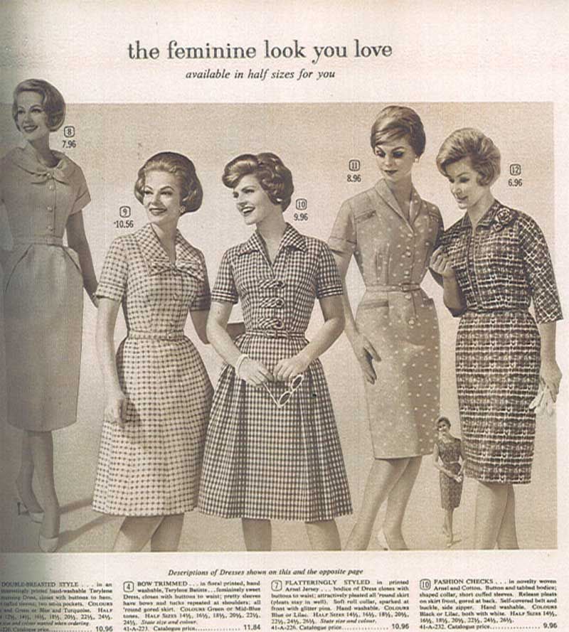
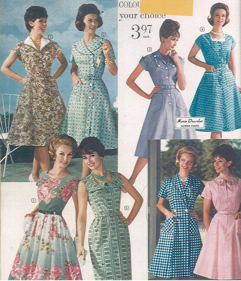
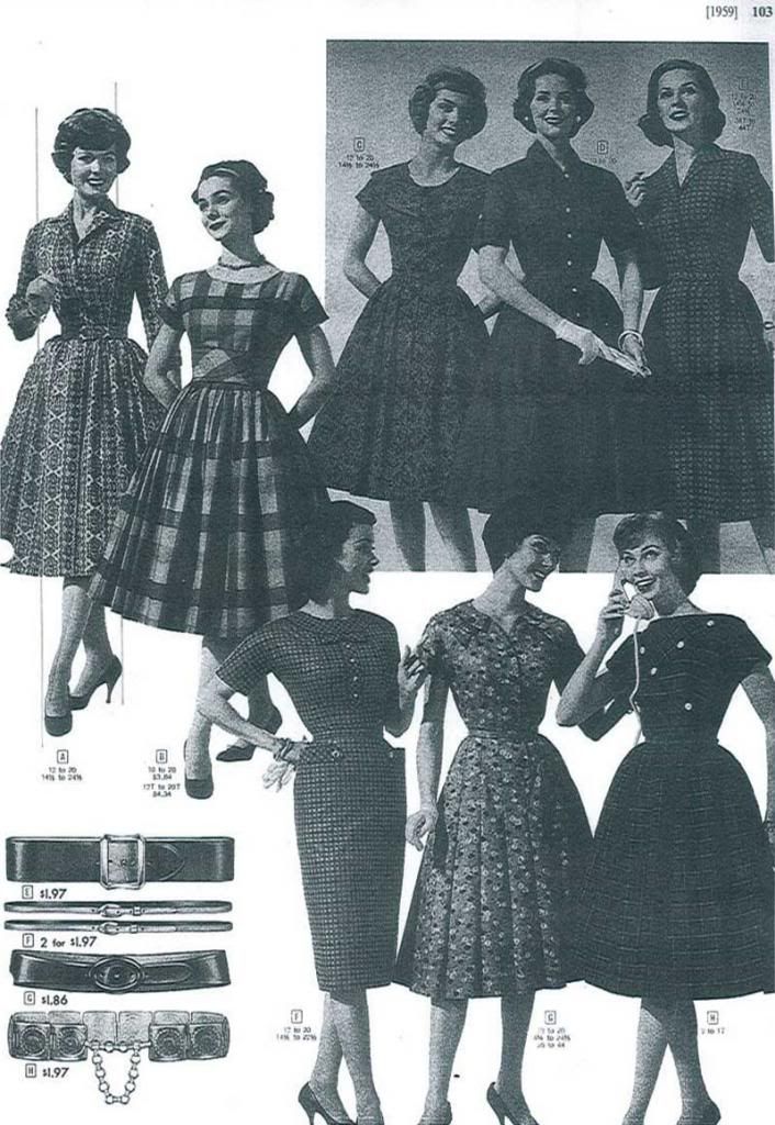
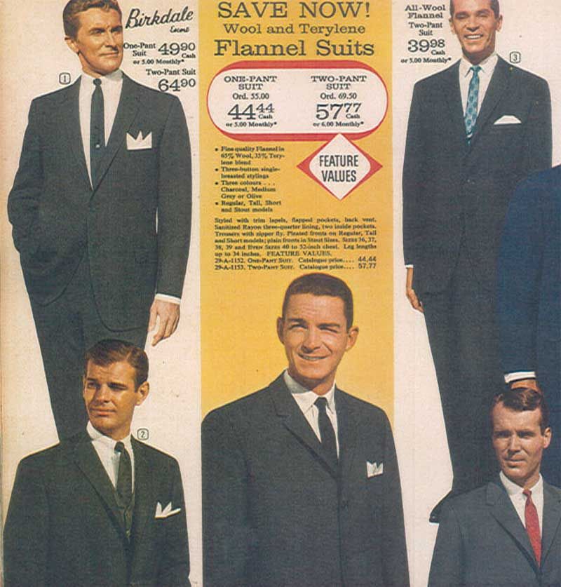
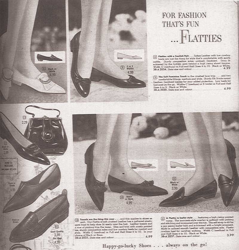
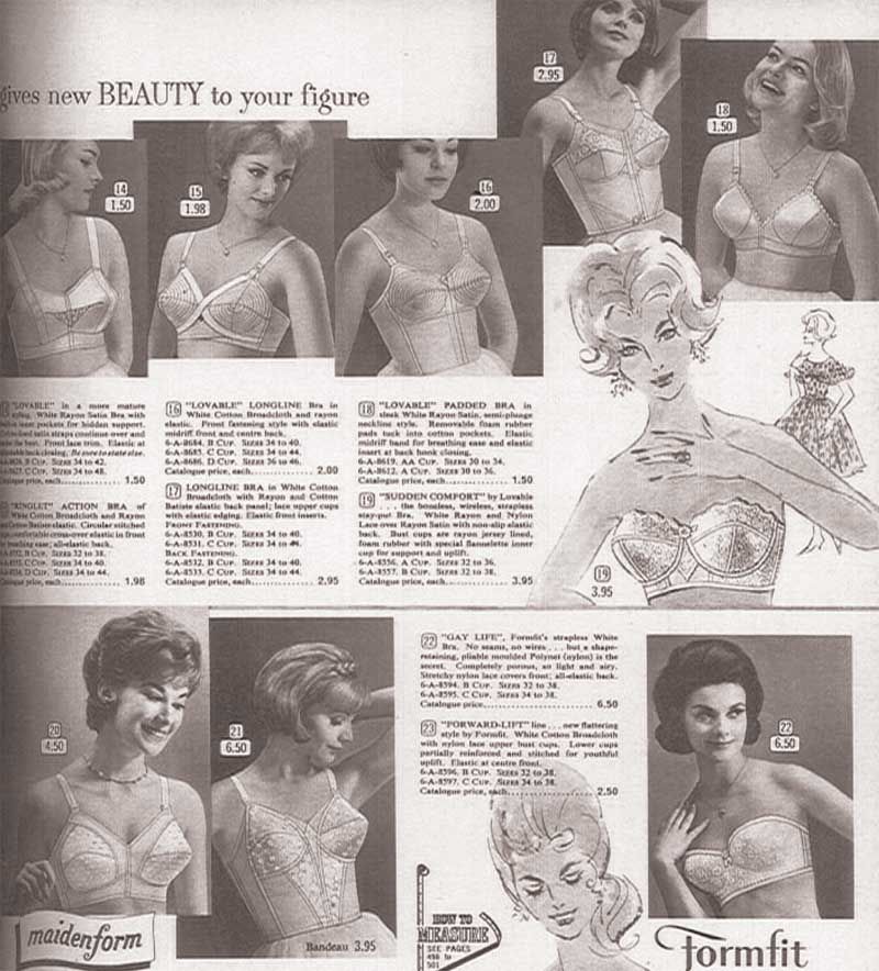
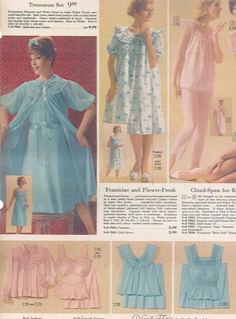
Now, my friends, comes my very favourite part of designing a show, the visual research!  I'm lucky enough to work at a theatre company with extensive resources, and managed to find Eaton's and Sears catalogs for Spring/Summer from 1957-1963, to get an idea of the evolution of style (most notable in women, particularly their hair! Biiiig changes took place then!) in the years leading up to and including the year the show is being set in (and was first performed). 

Now, these images really speak for themselves, so let's let them.  Enjoy some of the images I used to inspire and inform my design!


Tuesday, 4 June 2013

Designing a Debaucherous Duo: Harold Pinter's The Lover (Part 1)

Sex, sex, sex, and the Milkman.  Such is the daily normal life for British married couple Richard and Sarah.  But let's be clear: the sex isn't being had between the two of them.  Well, not exactly, anyhow.  
As we are introduced to the central figures in Harold Pinter's The Lover  they speak very frankly about their extra-marital sex lives.  Housewife Sarah has a lover who comes by many afternoons a week, and businessman Richard has a "lady of the night" he frequents on his way home.  The audience is shocked and amused and a little uncomfortable about how open the couple is about their regular infidelity.  But hey, different strokes, right?  When the milkman arrives mid-morning to deliver some cream (cue heavy bass and synthesizer... bow chica bow-wow) we're relieved with a bit of humour.  I mean, it's so cliche for it to be the milkman!! But he really has only come to deliver some cream, and Sarah doesn't want any - she's waiting for her lover, and he doesn't work for a Dairy.  

Sarah's lover is her husband, roleplaying in costume as the man "Max", and Richard's whore is Sarah dressed up and playing for him.  So how do you show a couple who play at infidelity without any infidelity at all? A couple who have begun to waver in their enjoyment of the other's fantasies, wishing the other didn't need them, but still wholly excited by their own?  A couple who don't have sex as man and wife, but as strangers and customers?

Originally created for television, Harold Pinter's The Lover was written in 1963, the same year that the production by 3 Peasants Productions (for which I am designing costumes) is being set.  We just had our first design meeting this past weekend, and I have dived into my process head first since then.  As my final designs are due in 1.5 weeks (I may have set myself a very tight deadline, eep! But sourcing costumes for a period show on a budget is going to take time, and the earlier I get approval from my Director, the sooner I can begin scouring thrift stores), I am well into the research stage of the design process.  I thought it would be fun to show you guys a peek into how I design a show at several stages in the process, from concept to creation.  So, let's see where it all begins!

I always look to the social climate of the time period the play is being set in, as well as the years leading up to it to get a real sense of what parts of the play resonate with the ongoing issues of the time.  1963 is a fabulous time to set this play, not only because it is the year it was written!  In late 1962, the "Profumo Affair" came ot light, a major scandal in British politics.  Secretary State of War, John Profumo, had an affair with Christine Keeler, reputed mistress of an alleged Soviet spy, leading to Profumo's resignation, and seriously damaging the reputation of Prime Minister Harold Macmillan's government.  In 1960, oral contraceptives ("The Pill") was made available for all married women, when it had previously only been prescribed for women with reproductive problems, as hormonal birth control treats a wide range of issues in addition to being a contraceptive.  This is a key issue with this play, where a married couple has sex several times a week and has never had children.  This is certainly something that would have occurred to the play's original audience, and is something that I'd really like to keep in mind as I work on this production: sexuality, especially in women was beginning to blossom, and those "swinging sixties" when free love reigned supreme, are just around the corner.  

In 1962-63, we're sitting just in the shift between the prevalence of the housewife (itself a backlash from WW2, as men returned home and reentered thew workforce) to the presence of the working woman, though the work roles women took were often limited at this time.  Sex, solely for pleasure and not for creating the average 2.5 children per household was on the rise with increasingly inexpensive contraceptives, and women were able to take more power in their own reproductive health.  

Through these social changes, fashion took a significant turn for women as well (realistically, though men's fashion does change over the years, the differences are much less marked, so we're going to focus on women here).  Hairstyles were shorter, fuller, and the youthful style of curls was replaced by upturned ends, waves and (later) sleek bobs.  Pants and flat shoes for women came into vogue, especially for the housewife: the days of vacuuming in heels and pearls were over, with more utilitarian clothing being preferred.  "Wash and Wear" fabrics and synthetics start popping up on the market, simplifying the home laundry routine, and bringing in brighter, bolder colours, and "fast fashion" - clothes made with arguably inferior materials and construction methods, making them inexpensive and resulting in fashion fads that changed frequently as clothing was viewed as more of a disposable item.  The strict rationing of materials like wool and nylon from the war was waning or lifted by this point, and the result was rampant consumerism.  Things became colourful, verging on garish, and trends in fashion and interior decorating were rapidly changing and evolving.  Also, The Beatles happened, and that shit was just cray.  So were teenage girls.  The two together were more explosive than napalm.

And we're looking at marriage in this time.  I think it could be very interesting!  I've already begun doing some quick sketches in anticipation of my Prelim deadline on Friday evening.  I'll share my prelim sketches here, and talk a bit more about the individual choices for the characters.  I'll also share some research (original Eaton's and Sears catalogs from 1957-1963 are a godsend)  to look more closely (and even in colour) at the incredible shifts in style through these years, and what this meant for women, including women like Sarah.

So stay tuned, and watch this show develop before your very eyes, before we open at the end of July!  

--Erin

PS. if you want a more thorough idea of the story, there's a modern production of it on youtube, and you can watch it here.  The original TV recording is also available here.  I hope my production will be quite different!

Monday, 8 April 2013

Design in Film: Stoker

It's no secret that I love horror films.  I really do go crazy for a good slasher flick/gore fest every now and again, but the ones I really love are the quieter, more suspenseful and cerebral scary movies.  Stoker fell quite perfectly into the second category, playing more on the audience's interest in the characters than their appetite for brutality.  Plus, the film is stunning.  I mean, stunning.  This is an aspect of horror films that is often glazed over, favouring "sexy breakdown" (oh, what, you never noticed how the female lead's shirt always rips to expose some midriff and her likely heaving, dirt-sculpting-her-cleavage breasts? Sexy breakdown.  It's a thing.) and dark locations to any real sense of style or atmosphere... I mean, other than anything you could call "dank".  God that's a gross word.  Dank.
I want to read in a giant wicker Hershey's Kiss!!
Though I managed to only hear about Stoker after it had been in theatres for over a month, I'm not going to go ahead and assume you've all gone out and seen it, and so I won't get too far into the plot and give away the nitty gritty, and will instead focus on the design elements of the film, which surprise surprise, I was totally in love with.  For the sake of context, however, here's a brief synopsis I lifted from my local movie theatre's website:

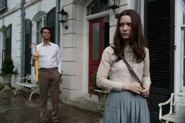
When her father Richard (Dermot Mulroney) is killed in a car accident, India Stoker (Mia Wasikowska) is left with to deal with her emotionally abusive mother Evie (Nicole Kidman). Soon after, a man who calls himself her Uncle Charlie (Matthew Goode), whom she never knew existed, moves in. The solitude of their woodsy family estate and the peace of their tranquil town are suddenly upended.
Although India hopes Charlie will fill the void left by her father's death, she soon comes to suspect that this mysterious, charming man has ulterior motives. 

I think that last line gives you a pretty good idea what kind of scary movie this is: very much a Hitchcockian slow burner.  It let's you get comfortable with your surroundings before it pulls the carpet out from beneath you - and it makes certain that those surroundings are deceptively welcoming and warm. And I've just now realized how few production stills there are of this movie.  Shame!
The locations in the film, both indoors and out (but particularly indoors) are immaculately put together, and provide an essential sense of tranquility, in the designs by Thérèse DePrez.  There's a heavy influence of mid-century architecture in the furnishings that initially confused Ephraim "Is this a period film or is it just designed strangely?", which I took to be a comment on the recently deceased father figure.  We learn early on that Richard Stoker was a prolific architect, and as we see more of his house, the landscaping, and his personal belongings, his aesthetic - clean, relatively minimal with a love of natural materials - makes it clear that though we may not get to know the character well through a personal presence in the film, we can come to understand much of him by what he has left behind.  Indeed, the only real clutter in Richard's office, are an abundance of tokens from his bonding experiences with India.
 The costumes are, of course, a key way to learn about the characters, and the costumes of Stoker, designed by appropriately mysterious duo Kurt and Bart (and yes, those are the only names offered) tell us a great deal about the personalities of individual characters, while relating them all to one another as well as the scenery.

Uncle Charlie is often smart, clean and tidy, but always with an air of the casual; a button up with no tie, the top button unbuttoned.  He looks put together in a way that feels predetermined, like a man who only owns neutrals so that everything can be paired together and he never has to think about it.  There is a sense of calculation behind it, but more in the pragmatic sense that if he has no real sense of style, he frees his mind up to contemplate other things.
Evie, on the other hand, seems to be borderline incapable of wearing anything not intended to be worn at a dinner party.  She looks so manipulative that it's the way you expect her to behave.  She feels often at odds with the house she lives in, preferring intricate lace designs to the clean colour blocking the other primary characters wear.  Despite the softness seen in her clothing, she herself feels rigid and uncomfortable within them.
India, clad entirely in soft neutral colours impeccably tailored within an inch of their lives - including many pieces I would kill to have in my closet - seems entirely comfortable within her rigid wardrobe.  Every year for her birthday, India has been gifted a pair of saddle shoes, which she wears until her next birthday, pairing them with airy silk frocks with crisp pleating, shirts buttoned to the very top button; a wardrobe where everything goes with everything else.  Sound familiar?

Beyond the set and costume design of this film, the cinematography and editing lended themselves to creating stunning images the whole way through; though the latter is certainly something that has to be seen to be understood.  I can't recall the last time the first words out of my mouth after a movie were "That was incredibly edited.  Just beautiful".  If these insights have piqued your interest, I really urge you to see the film, I promise you I have only scratched the surface.  The story, performances, and direction were all spot on.  So take a chance on a "scary" movie; you just might be blown away by what Stoker has to offer.
--Erin 

Thursday, 4 October 2012

Life As Of Late: Working Holiday and Faking It Till You Make It

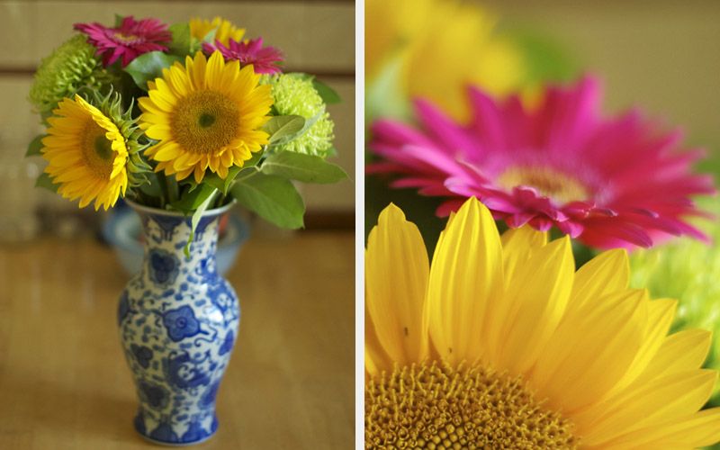
Ephraim has bought me more flowers than I've received my whole life over! And certainly they are the most beautiful bouquets
My vacation from work is slowly coming to a close, and I can hardly believe it.  Where have the weeks gone? For that matter, how am I going to finish reading these plays?! I'm going to have to turn to hypnopaedic methods to cram the last few in! Or, you know, lazy mornings while I'm in Quebec next weekend.  Ephraim tends to be a later riser than me, and sometimes I take this as a good excuse to stay in bed and snooze and cuddle, but other mornings I just want to GO GO GO.  Instead, I will READ READ READ and SIP SIP SIP some tea.

Actually that sounds pretty heavenly.  If I were a day timer kind of person, I would write that down in my daily itinerary. 
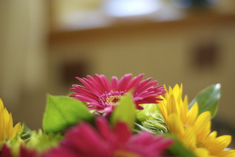
Congratulatory flowers to celebrate the opening of my first realized design for The Shaw Festival
I'm just finding it so difficult to believe that I'm about to begin my second season at The Shaw Festival.  I always hoped to be there for another season (or two!), but it doesn't quite feel like a reality yet.  None of my life feels that real right now, and maybe that's because things are running pretty smoothly for a change.  I've gotten pretty used to living from one disaster to the next, so this smooth sailing has got me on my toes; does something terrible lay in wait around the corner? Or did my hard work pay off (or did I just get really lucky??).  

I'm excited for the challenges and growth this next season will bring, and am particularly pumped to get started on model building straight away when I return.  Maquette building has been the area in which I grew the most in the last year, and I constantly surprised myself with my ability to achieve realistic and proportional model furniture and rooms at such a small scale (1/2" = 1').  There are so many skills I want to develop in my time at the Shaw, and the faith they have in me never ceases to both comfort and alarm me.  I'm faking my way through so much.  But maybe that's just what the whole game is.   

I've also been invited to my old University to talk to the first year theatre students about my life after York University, as part of a panel of alumni.  I remember idolizing Jeff Churchill of Jitterbug Boy Original Footwear (where I was lucky enough to work for a short time) from the instant he walked on stage when I attended the same lecture in first year.  I leaned over to my best friend and said "that guy.  I want to be that guy.  Look how cool his shoes are!".  Then we learned that he had hand crafted those shoes himself.  How can I possibly be as inspiring as him? How can the university hold my career path in the same ball park, let alone the same auditorium? I don't feel that I'm there yet, and I certainly have a long way to go till I "make it". But I really hope this is telling of the things to come.

Saturday, 22 September 2012

The Directors Project: Production Photos

Senora Carrar's Rifles
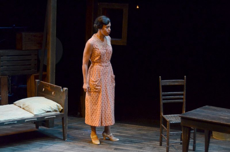
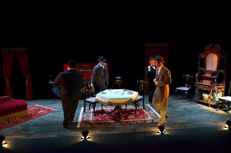
Gray Powell as Pedro, Beau Dixon as Foley Artist, Ben Sanders as Jose
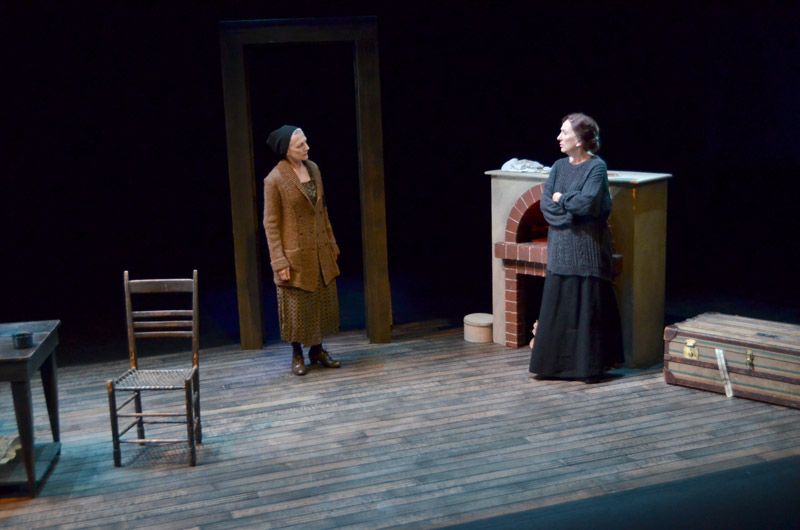
Sharry Flett as Old Mrs. Perez, Wendy Thatcher as Theresa Carrar
Alana Hibbert as Manuela
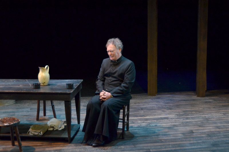
Benedict Campbell as Father Francisco
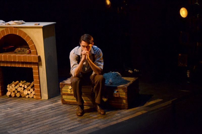
Ben Sanders as Jose
FourPlay
If Men Played Cards As Women Do
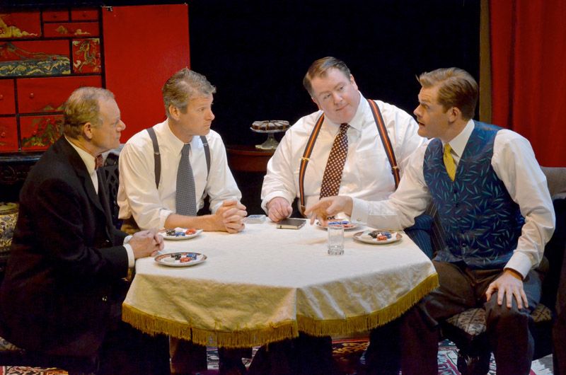
Peter Millard as John, Kevin Bundy as Bob, Neil Barclay as George, Martin Happer as Mark
Neil Barclay as George, Martin Happer as Mark, Peter Millard as John, Kevin Bundy as Bob
Overtones 
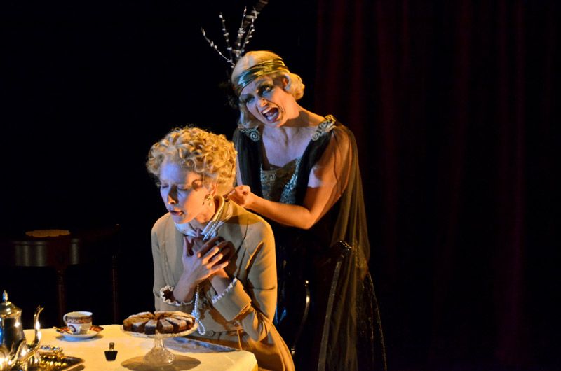
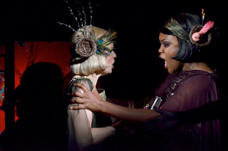
Julia Course as Harriet, Claire Jullien as Hetty
Kiera Sangster as Maggie, Ijeoma Emesowum as Margaret
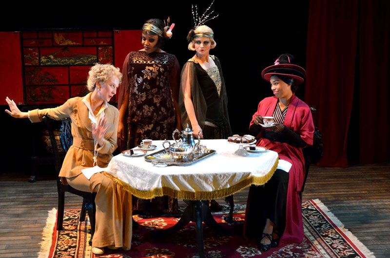
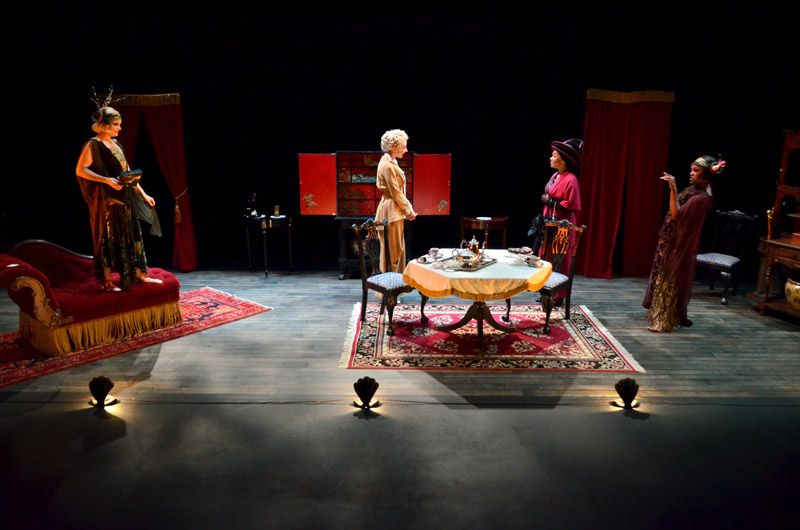
Julia Course as Harriet, Kiera Sangster as Maggie, Claire Jullien as Hetty, Ijeoma Emesowum as Margaret
Claire Jullien as Hetty, Julia Course as Harriet, Ijeoma Emesowum as Margaret, Kiera Sangster as Maggie
Claire Jullien as Hetty, Kiera Sangster as Maggie
All photos by Mark Callan.
Set and Costume Designs by Erin Gerofsky.
Lighting Designs by Conor Moore.
Neil Munro Shaw Festival 2012 Intern Directors: Michael Wheeler and Krista Jackson.

If you want to read more about the costume designs, check out my post on the Praxis Theatre Blog HERE

To see more about the process of painting the floor cloth (yeah guys, that's not real wood!), check out my post HERE

--Erin