Showing posts with label Retro. Show all posts

Friday, 21 June 2013

Designing a Debaucherous Duo: Harold Pinter's The Lover (Part 4)

Drum roll, please....

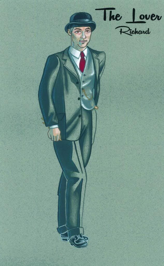
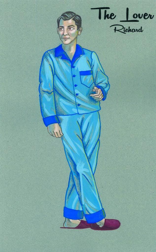
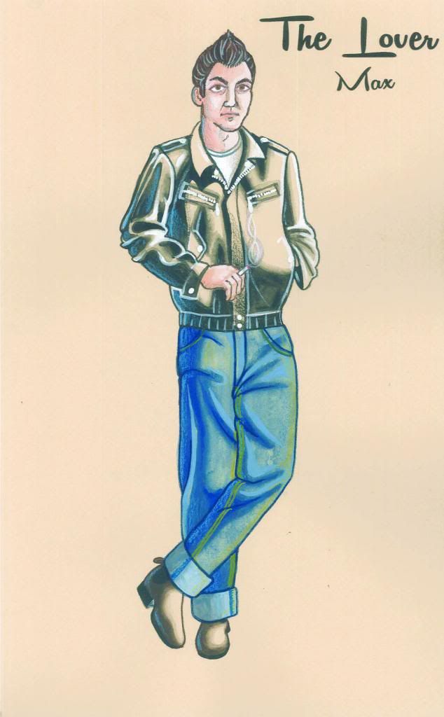
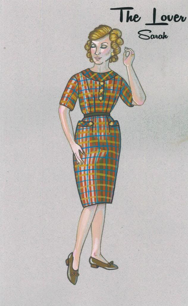
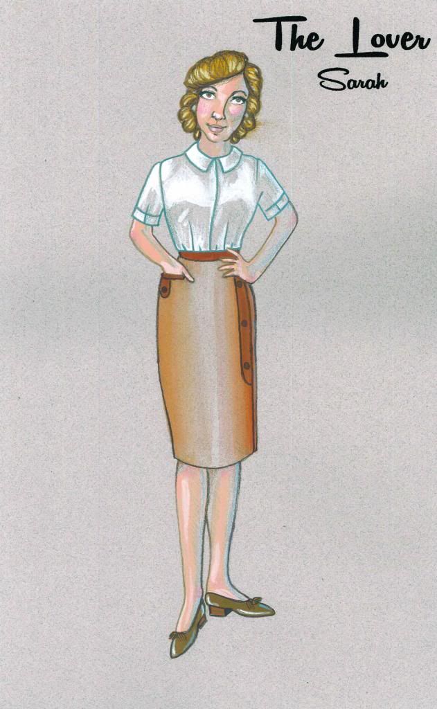
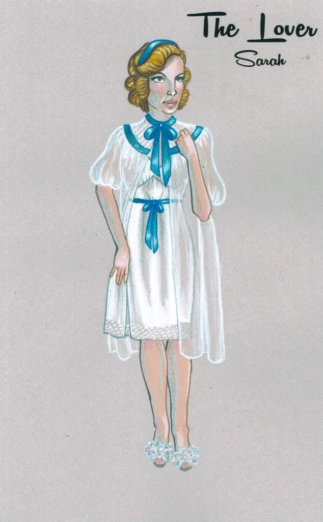
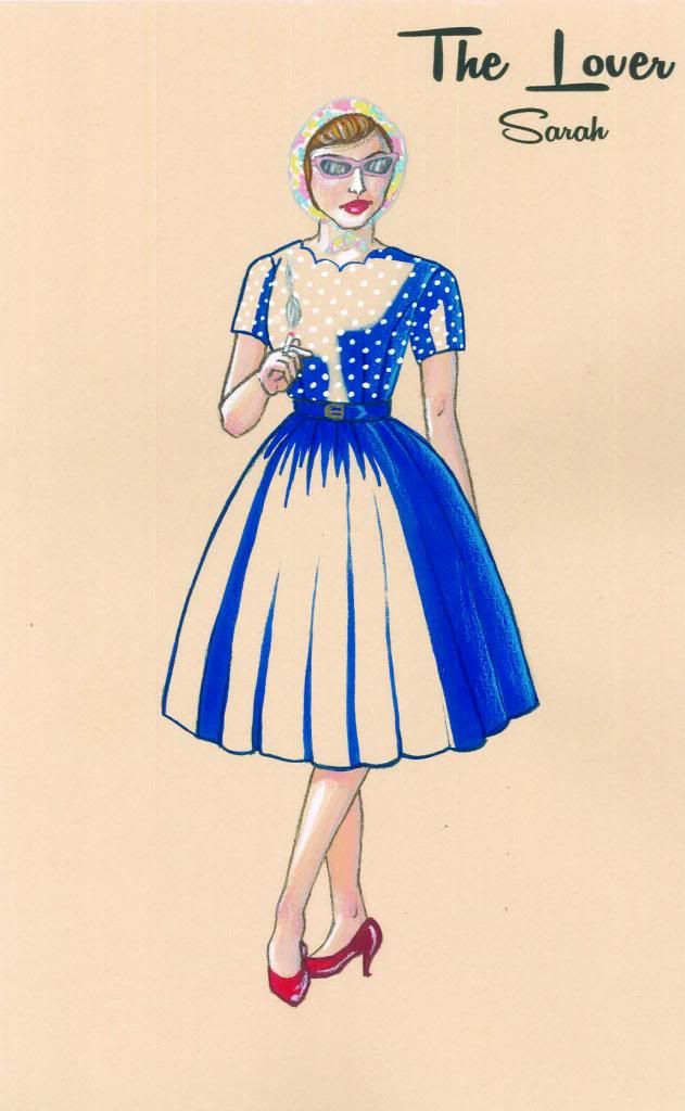
Aww yiss, it's finals time! All my finals were completed for a final design meeting last weekend, at which time they were all completely approved.  And let me tell you: feels good, man!  These renderings were all done in gouache, which if you're unfamiliar with it is a paint that is like if acrylic and watercolour paints came together to produce a perfect, freaky-deaky hybrid.  It can create solid colour (in a matte finish! unlike acrylic, which is quite shiny) and watery transparent washes, and is very often used by illustrators.  My brother bought me a set of gouache for the holidays (thanks Joe!) and this was my first big project with them.  I'm glad I didn't totally botch it! Details were added onto the paintings with pencil crayons (also got gifted some sweet Prismacolours for my birthday!), and the labels were printed onto the finished renderings.  You know what's more stressful than running a finished piece of art through a printer? Nothing. That part sucked.  But damn, do they look fancy! 

See if you can spot the (many!) changes between the prelims and the finished renderings.  That's why I stressed that prelims are quick: they're a way for you to communicate your idea to the director, and you can bet that they are going to have ideas to communicate right back.  Depending on your time constraints, you may go back and forth quite a bit.  As we only had 1 week between prelims and finals (yeah, these renderings are brought to you by Oreos and red wine) I had to take that information and make compromises and hope that I hit the money.  I did.  Now I just have to find everything I drew, and that is an entirely different battle!

Butcher Scanner wrecks white balance to the extreme.  This is as close to the originals as I could get them! The paper is grey-blue :)
Max is played by the same actor as Richard (and is, in fact, Richard in disguise!)
I've already been hitting the thrift stores hard this week to make our tiny budget stretch as much as possible, and I am so excited to get this show put together!  There are going to be some really fun and challenging sewing projects in my (near) future, and I'll be sure to share them with you guys here!  
 
--Erin

Monday, 17 June 2013

Designing a Debaucherous Duo: Harold Pinter's The Lover (Part 2)

Hi again sports fans!

It surely does feel good to have a moment to write here again.  The last two weeks have been a whirlwind, and I mean like a destructive "it's a twistah!!!" kind, not the fun-fancy bright lights and cotton candy kind.  12 hour work days were pretty regular.  And while it always feels good to be busy, that was really, really busy.  But now the final designs have been handed in and approved, and I can catch you all up in this behind-the-scenes look into my design process.

The other week we talked a lot about the play, and the political and social context of the time in which it was written, which is always important to consider when staging a production.  After all, theatre is a mirror of society, or some fancy-pants junk like that.  In this case, it really really is.  

Okay, so we know the where, the when, and the why of the play, now what does it look like?!

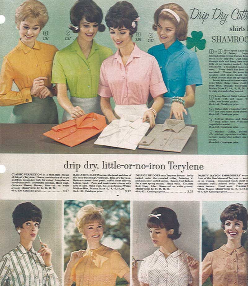
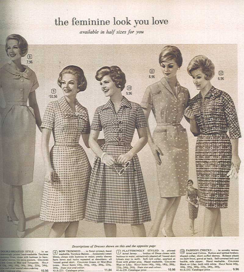
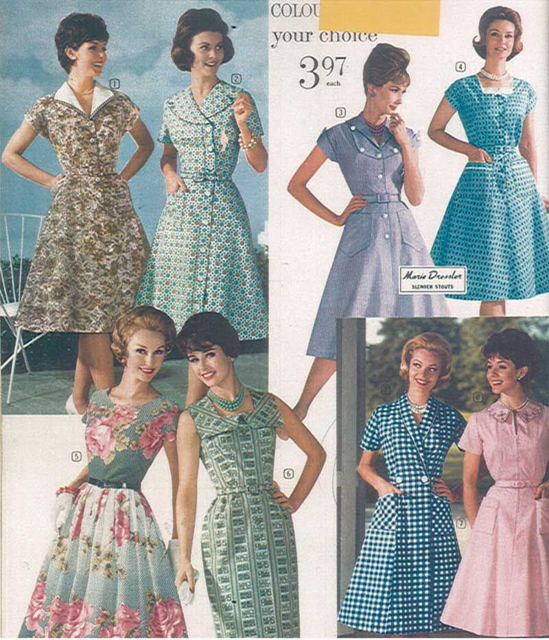
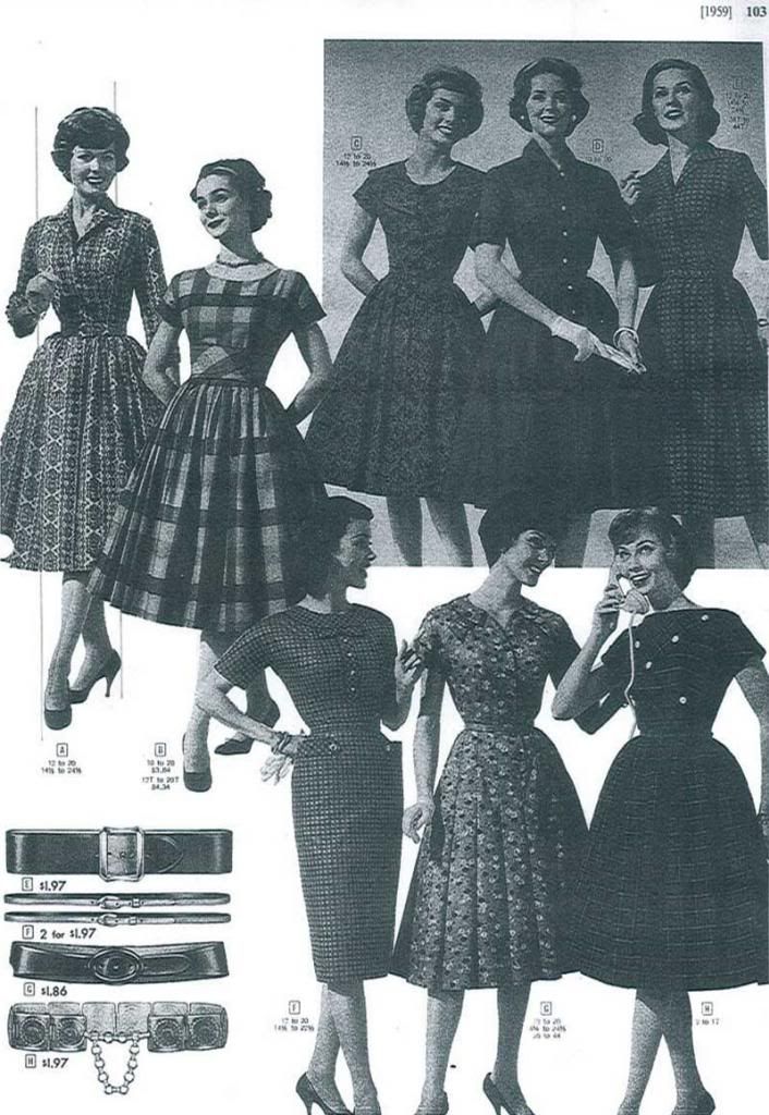
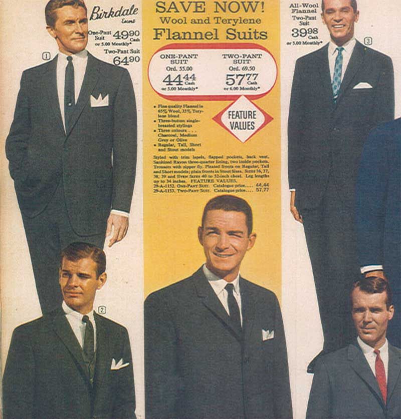
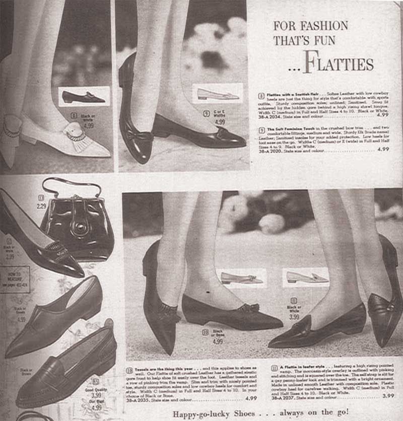
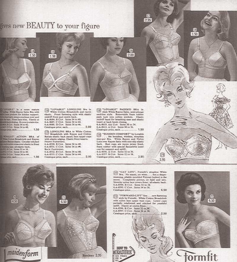
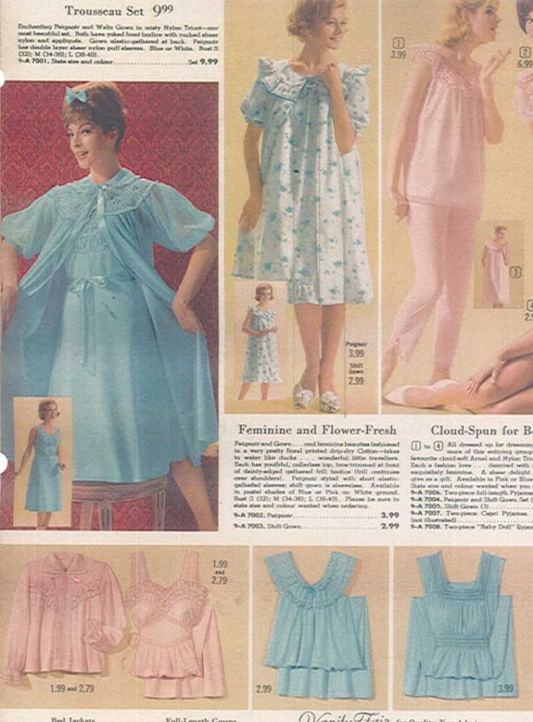
Now, my friends, comes my very favourite part of designing a show, the visual research!  I'm lucky enough to work at a theatre company with extensive resources, and managed to find Eaton's and Sears catalogs for Spring/Summer from 1957-1963, to get an idea of the evolution of style (most notable in women, particularly their hair! Biiiig changes took place then!) in the years leading up to and including the year the show is being set in (and was first performed). 

Now, these images really speak for themselves, so let's let them.  Enjoy some of the images I used to inspire and inform my design!


Tuesday, 4 June 2013

Designing a Debaucherous Duo: Harold Pinter's The Lover (Part 1)

Sex, sex, sex, and the Milkman.  Such is the daily normal life for British married couple Richard and Sarah.  But let's be clear: the sex isn't being had between the two of them.  Well, not exactly, anyhow.  
As we are introduced to the central figures in Harold Pinter's The Lover  they speak very frankly about their extra-marital sex lives.  Housewife Sarah has a lover who comes by many afternoons a week, and businessman Richard has a "lady of the night" he frequents on his way home.  The audience is shocked and amused and a little uncomfortable about how open the couple is about their regular infidelity.  But hey, different strokes, right?  When the milkman arrives mid-morning to deliver some cream (cue heavy bass and synthesizer... bow chica bow-wow) we're relieved with a bit of humour.  I mean, it's so cliche for it to be the milkman!! But he really has only come to deliver some cream, and Sarah doesn't want any - she's waiting for her lover, and he doesn't work for a Dairy.  

Sarah's lover is her husband, roleplaying in costume as the man "Max", and Richard's whore is Sarah dressed up and playing for him.  So how do you show a couple who play at infidelity without any infidelity at all? A couple who have begun to waver in their enjoyment of the other's fantasies, wishing the other didn't need them, but still wholly excited by their own?  A couple who don't have sex as man and wife, but as strangers and customers?

Originally created for television, Harold Pinter's The Lover was written in 1963, the same year that the production by 3 Peasants Productions (for which I am designing costumes) is being set.  We just had our first design meeting this past weekend, and I have dived into my process head first since then.  As my final designs are due in 1.5 weeks (I may have set myself a very tight deadline, eep! But sourcing costumes for a period show on a budget is going to take time, and the earlier I get approval from my Director, the sooner I can begin scouring thrift stores), I am well into the research stage of the design process.  I thought it would be fun to show you guys a peek into how I design a show at several stages in the process, from concept to creation.  So, let's see where it all begins!

I always look to the social climate of the time period the play is being set in, as well as the years leading up to it to get a real sense of what parts of the play resonate with the ongoing issues of the time.  1963 is a fabulous time to set this play, not only because it is the year it was written!  In late 1962, the "Profumo Affair" came ot light, a major scandal in British politics.  Secretary State of War, John Profumo, had an affair with Christine Keeler, reputed mistress of an alleged Soviet spy, leading to Profumo's resignation, and seriously damaging the reputation of Prime Minister Harold Macmillan's government.  In 1960, oral contraceptives ("The Pill") was made available for all married women, when it had previously only been prescribed for women with reproductive problems, as hormonal birth control treats a wide range of issues in addition to being a contraceptive.  This is a key issue with this play, where a married couple has sex several times a week and has never had children.  This is certainly something that would have occurred to the play's original audience, and is something that I'd really like to keep in mind as I work on this production: sexuality, especially in women was beginning to blossom, and those "swinging sixties" when free love reigned supreme, are just around the corner.  

In 1962-63, we're sitting just in the shift between the prevalence of the housewife (itself a backlash from WW2, as men returned home and reentered thew workforce) to the presence of the working woman, though the work roles women took were often limited at this time.  Sex, solely for pleasure and not for creating the average 2.5 children per household was on the rise with increasingly inexpensive contraceptives, and women were able to take more power in their own reproductive health.  

Through these social changes, fashion took a significant turn for women as well (realistically, though men's fashion does change over the years, the differences are much less marked, so we're going to focus on women here).  Hairstyles were shorter, fuller, and the youthful style of curls was replaced by upturned ends, waves and (later) sleek bobs.  Pants and flat shoes for women came into vogue, especially for the housewife: the days of vacuuming in heels and pearls were over, with more utilitarian clothing being preferred.  "Wash and Wear" fabrics and synthetics start popping up on the market, simplifying the home laundry routine, and bringing in brighter, bolder colours, and "fast fashion" - clothes made with arguably inferior materials and construction methods, making them inexpensive and resulting in fashion fads that changed frequently as clothing was viewed as more of a disposable item.  The strict rationing of materials like wool and nylon from the war was waning or lifted by this point, and the result was rampant consumerism.  Things became colourful, verging on garish, and trends in fashion and interior decorating were rapidly changing and evolving.  Also, The Beatles happened, and that shit was just cray.  So were teenage girls.  The two together were more explosive than napalm.

And we're looking at marriage in this time.  I think it could be very interesting!  I've already begun doing some quick sketches in anticipation of my Prelim deadline on Friday evening.  I'll share my prelim sketches here, and talk a bit more about the individual choices for the characters.  I'll also share some research (original Eaton's and Sears catalogs from 1957-1963 are a godsend)  to look more closely (and even in colour) at the incredible shifts in style through these years, and what this meant for women, including women like Sarah.

So stay tuned, and watch this show develop before your very eyes, before we open at the end of July!  

--Erin

PS. if you want a more thorough idea of the story, there's a modern production of it on youtube, and you can watch it here.  The original TV recording is also available here.  I hope my production will be quite different!

Thursday, 30 May 2013

DIY: Craft a New Gusset for a Vintage Bikini

You've found an awesome bikini at the thrift store/garage sale/dumpster, and you feel awesome in it... or you would, if it weren't for the nagging knowledge of this bikini's former life.  
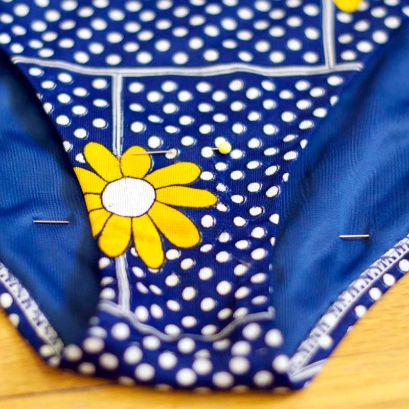
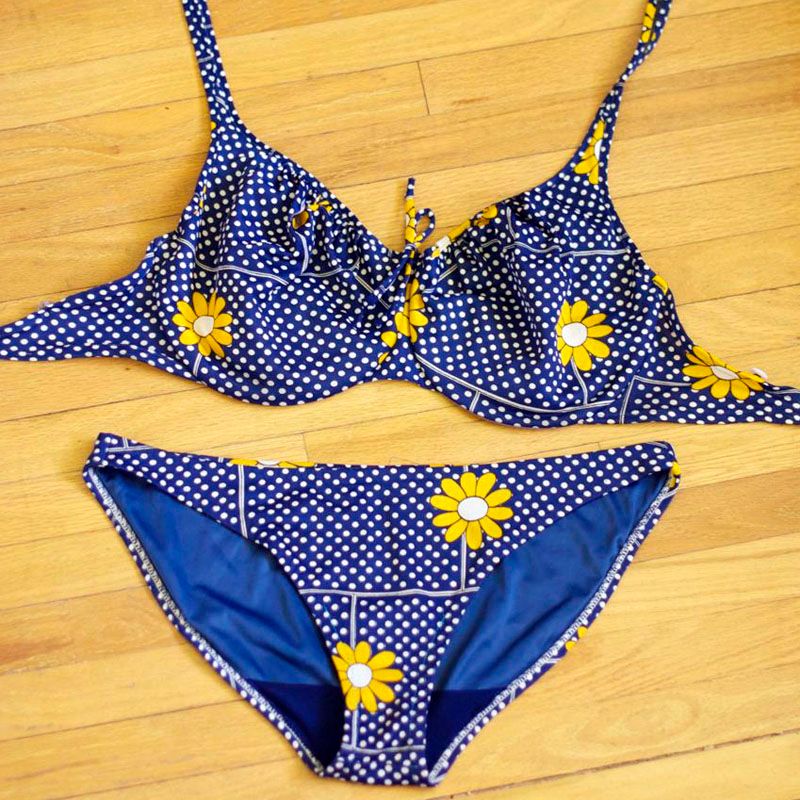
When I picked up this amazing 1960's bikini at the Toronto Film Costume Sale last weekend (for $5!!! what up!) I could immediately hear my Mother making gagging noises in my head, just over the thought of wearing someone else's... well, underwear, basically! And yeah, it's true, that is pretty gross.  So I said to Ephraim all excitedly that I was going to replace the gusset and this would be the best bathing suit ever!!
He said something to the effect of "Awesome! That all sounds great! But I don't know what a gusset is"
"It's the crotch.  Well, the crotch lining.  It's the clothing housing to lady bits, and should only really house one's lady bits.  Soooo I'll make my own!"

So today, we're gonna sew a new gusset into our new(old) bikinis, and start anew! This project takes under an hour, can be completed by hand or machine, and is simple enough for any skill level.  So, let's get to it, because temperatures are rising!
1//  mark with a pin how high you want the rise of your gusset onto the bikini bottoms.  It may be helpful to compare with a pair of panties that fit you well!
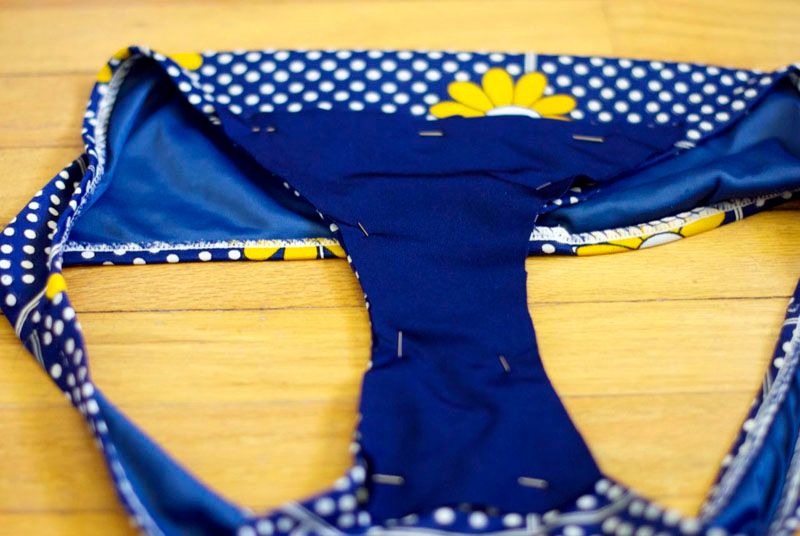
2//  lay your bottoms on top of the fabric you will be using for the gusset.  I used some lycra I had in my stash box.  Pin the new fabric and bottoms together, and mark the new fabric along the leg holes, up to the rise you decided upon in step 1.  
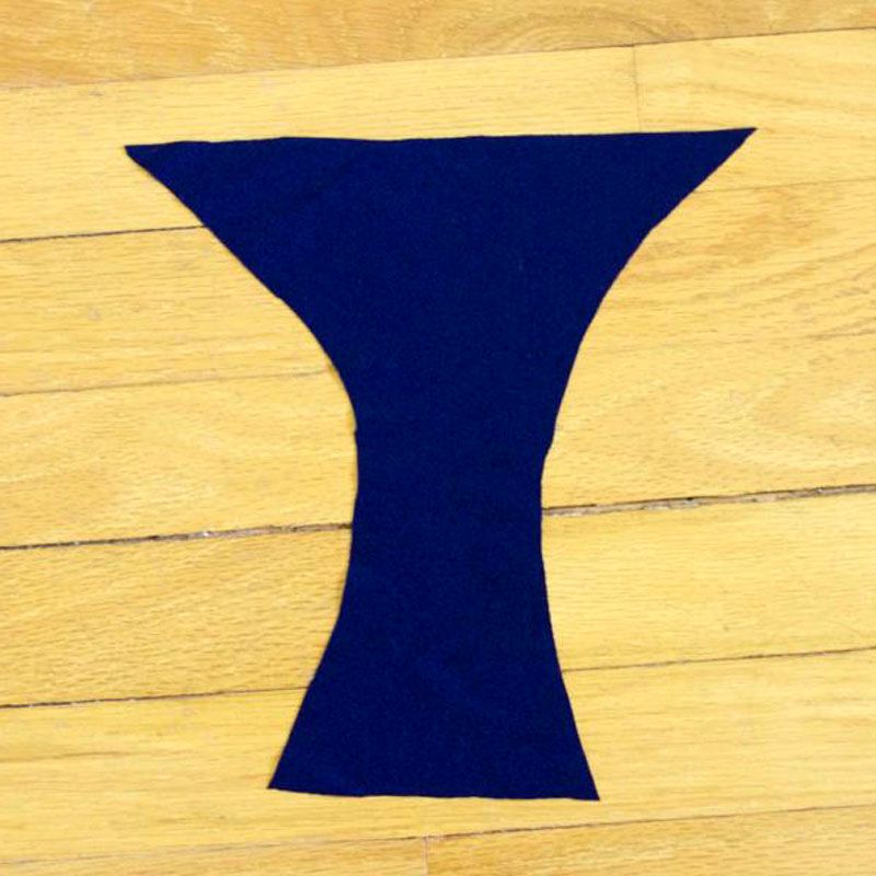
3//  Carefully cut out the new fabric along your guides, and straight across the marked rise points at the front and back.  I kept everything pinned together, because I couldn't easily see my marks on my dark fabric! Be careful not to nick the suit with your scissors, and go slowly!
4// Isolate your new gusset material, and trim up the curved sides.  This is a good time to try to get the cut edge nice and smooth, but don't worry too much; this is all about function and way less form!
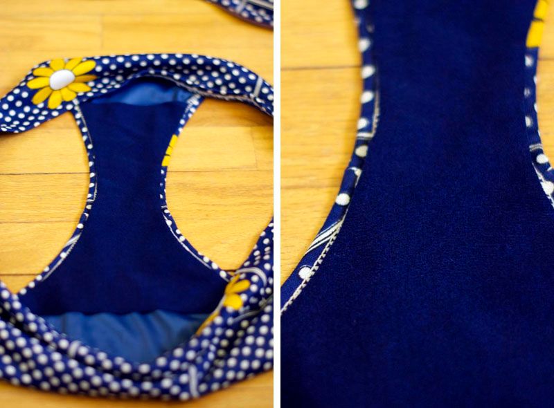
5// lay the new gusset into your suit bottoms.  As you can see here, I trimmed my sides just enough to stop them from overlapping the edge of the suit, but tried to stay around where the suit was already sewn.  It's not perfect, but that's okay!
6// Pin it within an inch of its life! The suit and in my case the gusset material as well were very slippery, and wanted to move around a lot.  To avoid bunching and shifting as you sew, pin pin pin away.  You will only sew the gusset in around the legs, and not across the tops.
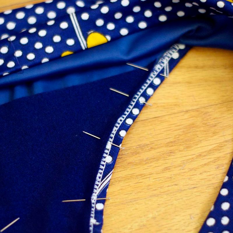
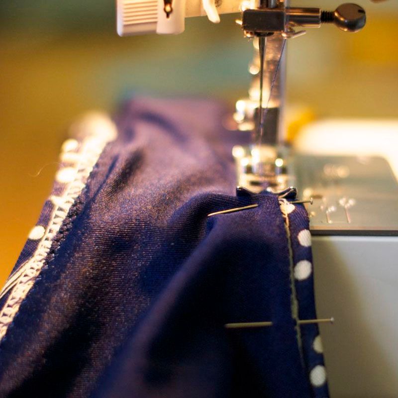
7// Sew the gusset into your suit with a short and narrow zig-zag stitch.  You can also sew it in by hand with an angled top stitch, to allow the fabric a little give.  Try and contain the edge of the fabric within your zig zag, to hold it down neatly. Optional: Hand tack the rise of the gusset in to the lining of the suit.  It should lay nice and flat on its own, but you may want a more "clean" look. 
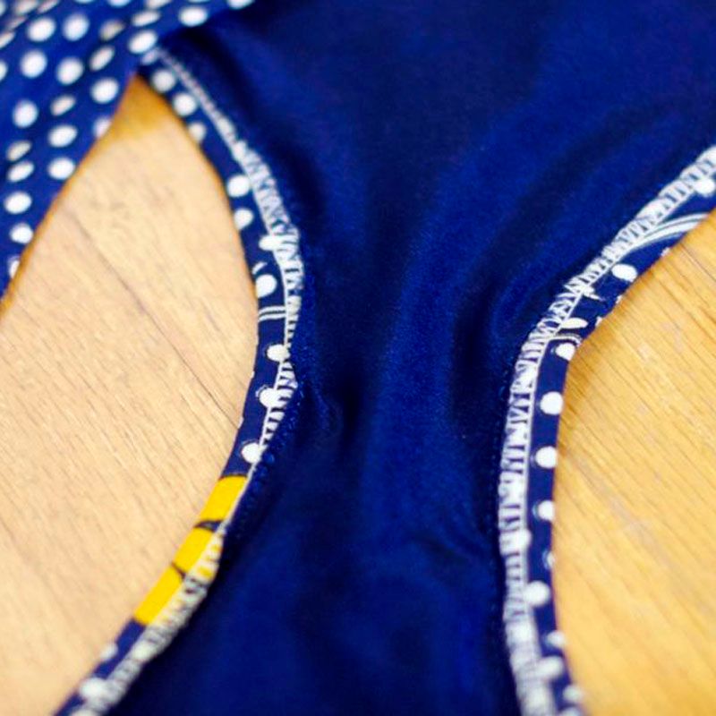
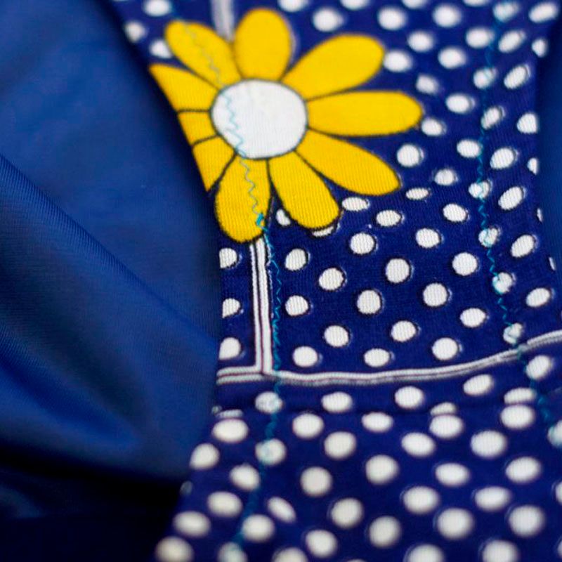
This is what your suit will look like after you've sewn the new gusset in.  I used a contrasting bottom thread, because I liked the look of it.  Or maybe it's because I didn't feel like loading a new bobbin.  You'll never know (and I can guarantee you, nobody is going to notice!! Just keep it relatively close)

Now put that gorgeous suit on and get outside! Because it's really hot out, and so are you.

--Erin

Tuesday, 23 April 2013

OOTD: His and Hers - Green Duds and Fancy Wheels

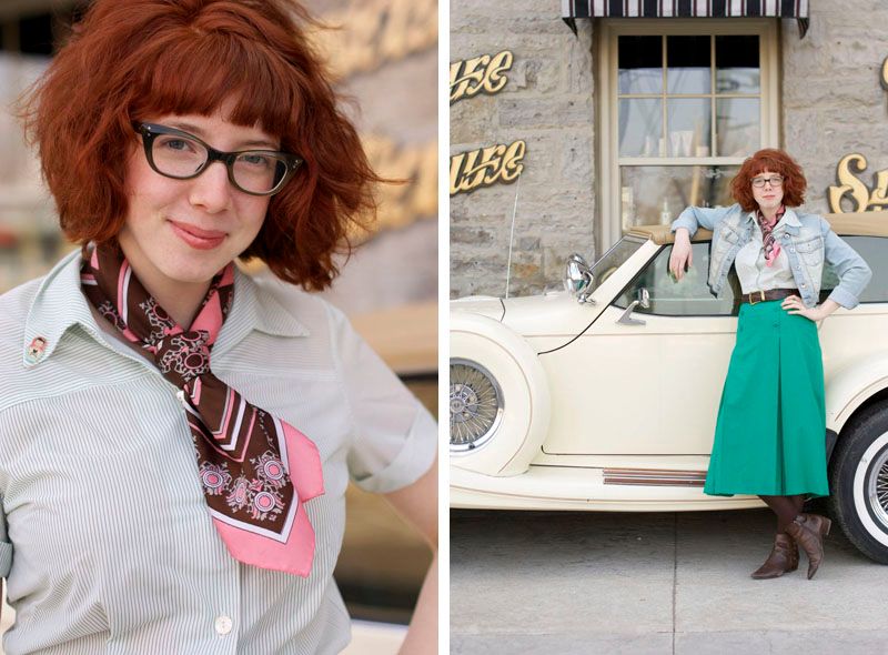
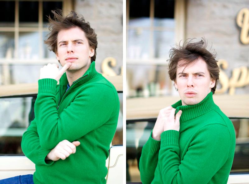
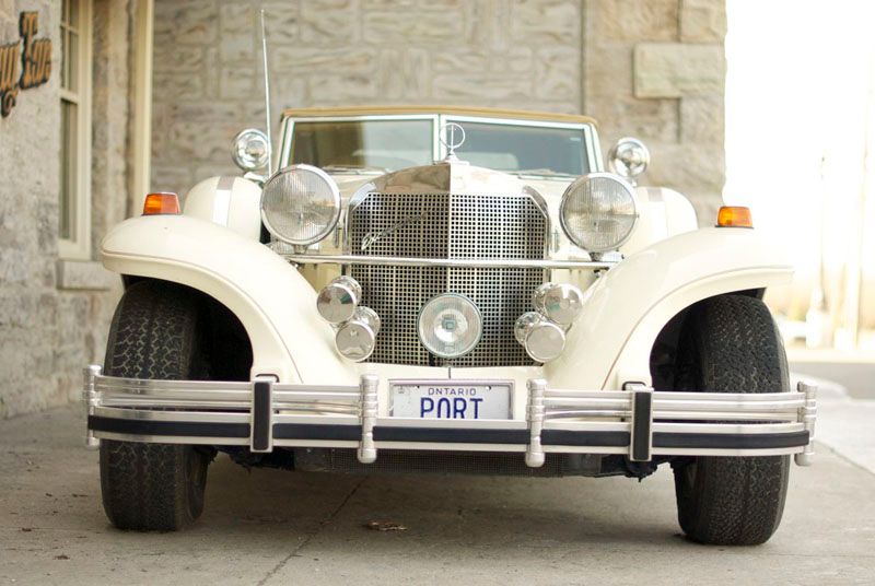
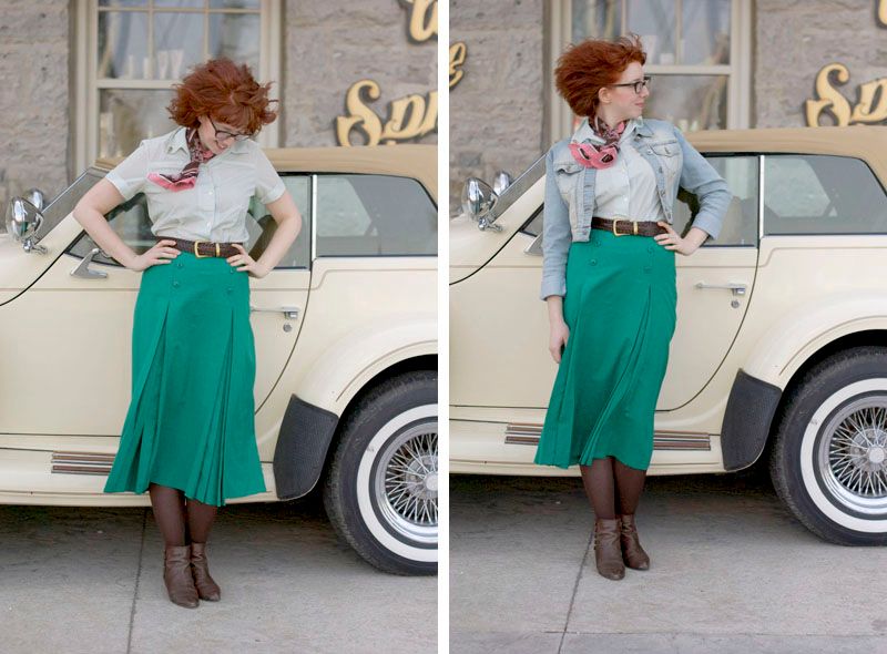
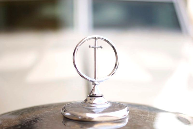
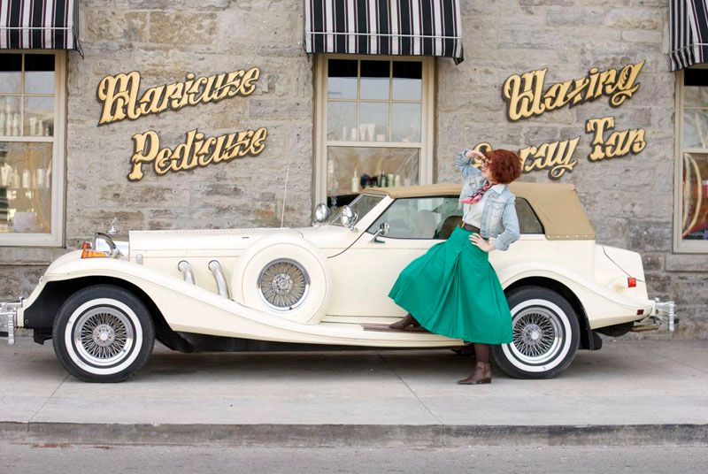
These photos were something of a spur of the moment type happy accident.  It was the first really warm and sunny day this year, and Ephraim and I spent the afternoon running errands in St. Kitts, with the plan of finishing up with going to see the new Evil Dead movie.  But wouldn't you know it, we ran out of things to do a good hour before the movie started, and so we hunted for a coffee shop to wait in.  In our search we ended up trying to turn around in this parking lot, and found this SUPER SWEET old car!! And well, when you come across a beaut like that, no matter how windy it is (and oh, was it ever!!) you take some photos! So here we are showing off how much green the two of us can wear.  This was unplanned, but dammit, neither of us was changing, that might be dumber than coordinating our clothes to begin with!
I can tell it's going to take some getting used to and maybe a bit of problem solving to deal with just how incredibly crazy the wind makes my hair now that it's so much shorter.  It looks like I'm going to need to invest in a few more hats! Which is a solution I can really get behind :). 
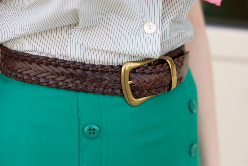
The skirt I'm wearing came from my grandmother.  At first I wasn't so sure about the skirt, as the style of pleating and the (albeit faux) front buttoned flap is very 1910's; which, when it's a time period you typically work in, can get a little too costumey for my taste.  Digging through my closet to find something to pair it with, I realized this 1960's top matches the colour perfectly, and happens to be just long enough to tuck into a high waisted skirt! it really was meant to be, I think!  And wouldn't you know it, the folks at work quite liked how Shavian I look in this outfit.
THE DEETS
(hers)
Striped Shirt: Vintage, free from work
Cropped Denim Jacket: Charlotte Russe
Green Pleated Skirt: Vintage, inherited from my grandmother
Scarf: Thrifted
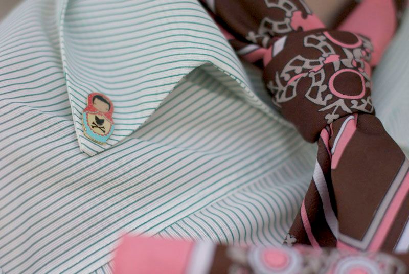
Matryoshka Lapel Pin: Cry Wolf
Belt: Church Sale
Tights: ??
Brown Booties: Vintage, Toronto Clothing Show

(his)
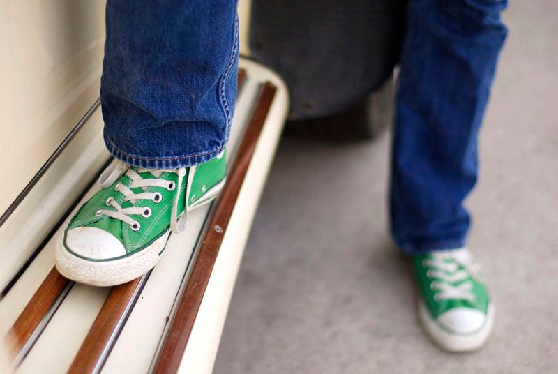
Sweater: Gift
Jeans: Levi's
Shoes: Converse
I hope your week is off to a great start!
--Erin

Tuesday, 26 March 2013

OOTD: Floral and Mint

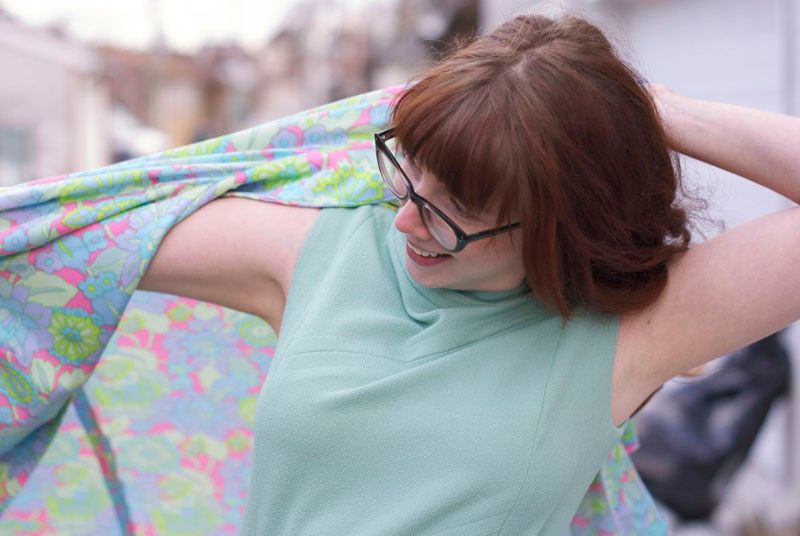
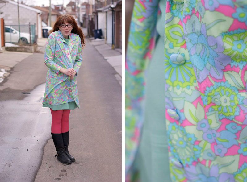
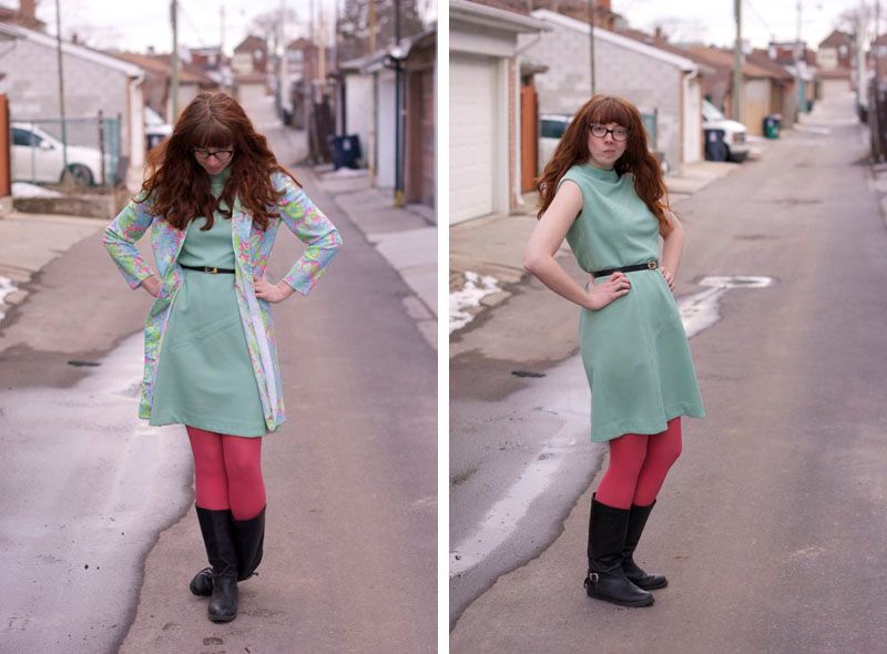
This week, after inheriting a bunch of new clothes, I took the time to go through everything in my closet.  I set aside the clothes I was prepared to donate, the clothes that needed some TLC (most notably stain removal - my Bubba had great taste but sloppy eating habits) and the clothes I hadn't gotten around to laundering yet.  Among that last pile was a heap of floral vintage I had scored from work (along with the pieces featured here and here and plenty of others), including this jacket and dress.  Though the pieces aren't a set, the mint in the dress is so similar to the mint in the jacket, that they simply had to be worn together.  I'm fairly certain that the dress was a bridesmaid's dress (the donor had mentioned many of the items were from special occasions and only worn once), and hell, if she couldn't get more wear out of the items, I sure will!
 The Deets:
Floral Jacket: Vintage, Free
Mint Dress: Vintage, Free
Tights: Anthropologie ($5.  Sale room, you my best fraaaan)
Black Riding Boots: Value Village 
Black Snakeskin Belt: Hand-Me-Down

The "Grayed Jade" (14-6011), "African Violet" (16-3520) and "Tender Shoots" (14-0446) in jacket are three of Pantone's colours of the season, so for 45 year old items I scored for free, I sure am looking on trend! On a sidenote, I went shopping for paint chips this weekend, and paint colour names are just the most ridiculous thing ever.  "Tender Shoots"? Seriously? But I digress, back to the outfit!!  Paired with a black snakeskin belt I inherited from my grandmother, and my favourite black riding boots, I balanced that springy feeling with the warmth I need for these not-quite-springy feeling days.  I definitely look forward to busting this combo out as the days warm up, though the polyester is going to limit that somewhat!! I just can't abide by feeling like I am wearing a plastic bag.  Even if it's floral.

--Erin

Monday, 26 November 2012

Ships Ahoy: Navy White and Red Life Preserver Print


*** First, a quick notice.  I have made the blog more narrow for easier viewing for those with smaller screens.  All images can be clicked to enlarge.  I am going through the archives to do a rough resize, but it will take some time.  Please leave a comment if you see a particularly egregious formatting error. Thanks for your patience!***

I finally took the plunge and dyed my hair dark! I have always envied those girls with dark beautiful auburn hair, and now I walk among them. I was going on two years since my last professional haircut, which is obviously really long overdue. I can't believe how light my hair feels. Or how confident I feel to style it! Turns out I had no idea what to do with my hair simply because there was too much of it to really do anything with. Well, unless I wanted a style evocative of the trends of the Victorian lady, which, no. Point is, I am so so happy with my new hair. The cut and colour look amazing with my new frames (not pictured, I am taking them to get my prescription put in next weekend), and I am really pumped to do a bit of retro styling in the coming weeks. Exciting times, friends! Okay enough blabber, more glamour. (HAH)
It was snowing and I was FREEZING
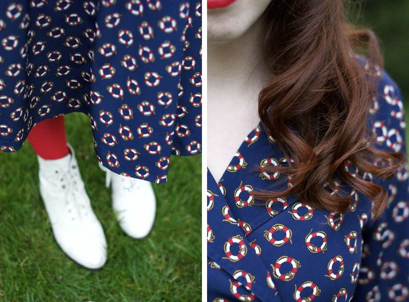
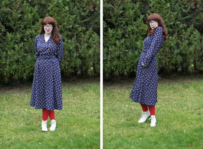
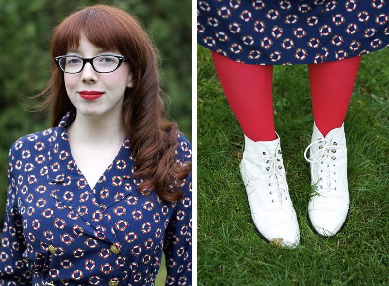
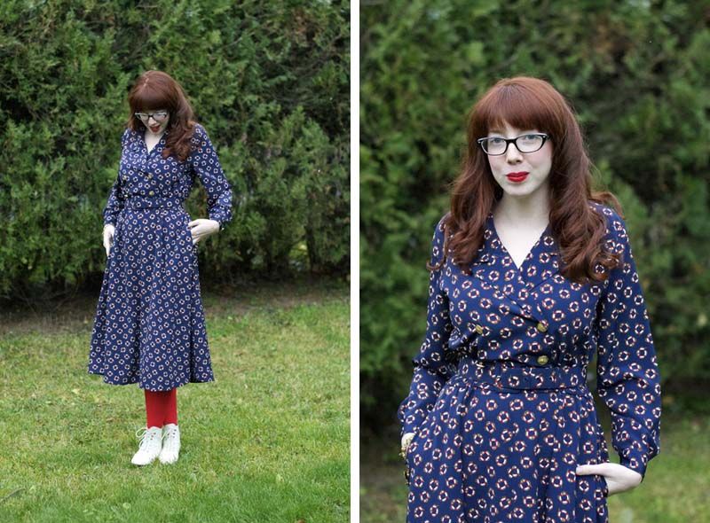
I picked this dress up from the Goodwill last week, and took a bit of a gamble on it. I basically had to be in and out of the store pretty quick, so I bought it without trying it on. It's a petite 10, neither of which are sizes I wear, but it actually worked out pretty perfectly! To be fair, some of that may be because I can cinch the waist in with that amazing self-fabric belt, but all in all I'm calling this a win. And I'm glad it worked out, because thrifting is getting expensive! All the dresses I saw at the Goodwill were marked at $10 (well, $9.99 to fit in with their weird palindrome pricing). It's not so easy to pick up whatever looks interesting anymore, but on the same note, my closet is way too full already. I suppose I'll have to learn to be more picky, hard as it may be! Have you found thrifting in your town to be becoming more costly, too?

It has pockets!
The Deets
Nautical Print Dress: Thrifted
Red Tights: Topshop
White Leather Ankle Boots: Vintage
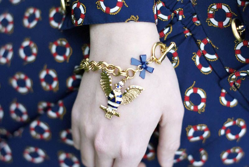
Bracelet: Betsey Johnson (gift)

What hair colour have you always wanted to try, but never worked up the nerve? Give it a shot, it's only hair!!

--Erin


Tuesday, 23 October 2012

Embracing my Retro Kitchen

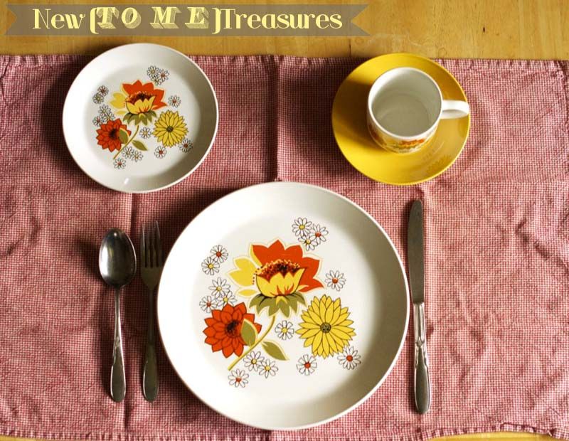
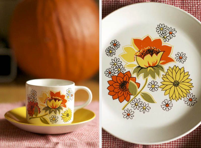
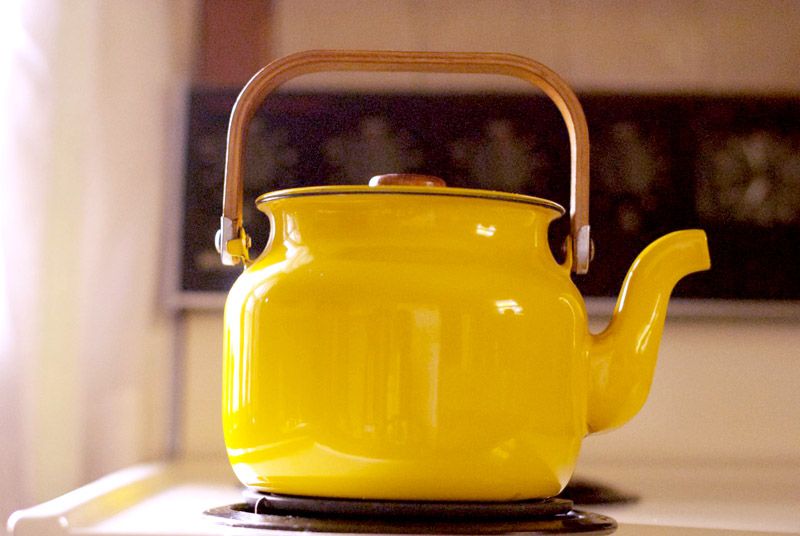
Value Village was very good to me this weekend.  Not only did I get what I needed for my halloween costume, but I also picked up 4 place settings worth of the greatest dishes! Even better, there are cups and saucers to match.  But even better than that, I also found a metal kettle that looks charming with the set.  My house is very dated, and there's not a lot I can do about the decor.  So I've tried to embrace the 70's nature of the house, despite normally being more of a 50's or 60's girl.  The print on these plates has colours that can fit into either era, so they work in this kitchen and will hopefully work in one I have more design control over too! 

Speaking of design, as you can see I tried out a couple new fonts in this post.  I have been toying around with some design changes, including the fonts.  What do you think? Yay or nay?

--Erin