Tuesday 25 June 2013

Controlled Combat for the Adventurous Actor -or- How To (Safely) Get Your Ass Kicked On Stage

I might be dating a psychopath.  A sweaty, sweaty psychopath.
Over on Jetpack Wonder Stories (lookit that fancy button right at the top o' the sidebar!) today, Ephraim is talking about his experience taking a stage combat class! The post features photos I took of him looking cool, and because he's nice and level headed like that, he also published some of the not-so-cool ones (minus one that makes him look like a gremlin which makes me laugh every time I look at it.  I kept that one for myself, even he doesn't have a copy!).  

If you've ever wanted to know more about those fights that happen on stage or in the movies, or thought they'd be super fun to be a part of, head on over to Jetpack Wonder Stories tohear what it felt like to look like you're kicking the crap out of someone, while keeping things totally safe.  Spoiler, it means a lot of grunting, and sweating, and acting that makes for some very bizarre still images.  

Totally makes me wish I had been this serious about it when I did my stage combat course in high school!  I got to "kick" my friend in the face, repeatedly.  Also we learned how to "slam" someone's head into a wall or a desk.  It was awesome, and really hard work to get everything just right, but being 16, we used our powers only for evil (and to freak people out in the hallways).  Drama kids.  What a bunch of weirdos.

--Erin

Friday 21 June 2013

Designing a Debaucherous Duo: Harold Pinter's The Lover (Part 4)

Drum roll, please....

Aww yiss, it's finals time! All my finals were completed for a final design meeting last weekend, at which time they were all completely approved.  And let me tell you: feels good, man!  These renderings were all done in gouache, which if you're unfamiliar with it is a paint that is like if acrylic and watercolour paints came together to produce a perfect, freaky-deaky hybrid.  It can create solid colour (in a matte finish! unlike acrylic, which is quite shiny) and watery transparent washes, and is very often used by illustrators.  My brother bought me a set of gouache for the holidays (thanks Joe!) and this was my first big project with them.  I'm glad I didn't totally botch it! Details were added onto the paintings with pencil crayons (also got gifted some sweet Prismacolours for my birthday!), and the labels were printed onto the finished renderings.  You know what's more stressful than running a finished piece of art through a printer? Nothing. That part sucked.  But damn, do they look fancy! 

See if you can spot the (many!) changes between the prelims and the finished renderings.  That's why I stressed that prelims are quick: they're a way for you to communicate your idea to the director, and you can bet that they are going to have ideas to communicate right back.  Depending on your time constraints, you may go back and forth quite a bit.  As we only had 1 week between prelims and finals (yeah, these renderings are brought to you by Oreos and red wine) I had to take that information and make compromises and hope that I hit the money.  I did.  Now I just have to find everything I drew, and that is an entirely different battle!

Butcher Scanner wrecks white balance to the extreme.  This is as close to the originals as I could get them! The paper is grey-blue :)
Max is played by the same actor as Richard (and is, in fact, Richard in disguise!)
I've already been hitting the thrift stores hard this week to make our tiny budget stretch as much as possible, and I am so excited to get this show put together!  There are going to be some really fun and challenging sewing projects in my (near) future, and I'll be sure to share them with you guys here!  
 
--Erin

Tuesday 18 June 2013

Designing a Debaucherous Duo: Harold Pinter's The Lover (Part 3)

Oh boy, finally getting back into the swing of things, and all I'm doing is bombarding you with all this design bunk, huh? Well too bad, because this show is the only thing on my mind right now!! Also all my sketches are currently on my work computer, which is imminently being replaced, so I need to write these posts and empty out my personal files.

Today's topic: Prelim Designs, or, How I Learned to Stop Worrying and Love My Ugly Sketches.

So, you've talked to the director, you have some kind of psychologically driven concept for the show, you have this huge stack of research, and now what? Prelims.  Now it's time to take all that research and turn it into loose quick sketches for each costume.  Everyone's approach to this is a little different.  Some people may want to create sort of "mood boards" (oooo) of colours and textures for each character, to help keep a consistent thread and track the visual development of the character throughout the story.  Some people may do a similar thing with a giant list of words.  Other people still don't write any of this shit down, and just internalize it.  I'm more of the latter party.  "I've read this one act play 6 times, if I don't get it now, I am never going to".  

You know who the characters are, what their individual experience of the story is, and have some idea how that needs to translate to their "look" in the show.  Now, pick up a pencil, and draw.  The key to prelims is don't be too precious about them, and don't let them take a long time.  You may even draw multiple versions of one look, if you think you and your director have different visions, or you're still working some details out in your head.  Just draw a bunch, and then select the sketches you're going to show your director which you feel best represents your vision for the show.  Your sketches may eb beautiful, or they may look like (to borrow a beloved phrase) hammered-ass, like mine.  Doesn't matter, just as long as the ideas get out there, I mean the director is going to ask you to change things anyway!

Here are my prelims for The Lover.  Please, try to stifle your laughter.  I should not be putting these on the internet and claiming to have any artistic ability, but I promise you these sketches are a tool, and are as quick and dirty as I get.  Deadlines, y'all.

Sarah, look 1
Sarah, look 2
Sarah, look 3
Richard, look 1
Richard, look 2
Max
John, The Milkman
Next time, I'll be sharing my final designs for The Lover.  I promise, they are way prettier.  You won't believe all the things that changed!! Prelims really are a tool of communication, as all artwork for theatre is.  It may be beautiful, or it may be sloppy, it may be realistic or it may be abstract; the renderings a designer does need only do one thing really well: show the people responsible for making the show what it is that they want.  But more on that next time!

--Erin

Monday 17 June 2013

Designing a Debaucherous Duo: Harold Pinter's The Lover (Part 2)

Hi again sports fans!

It surely does feel good to have a moment to write here again.  The last two weeks have been a whirlwind, and I mean like a destructive "it's a twistah!!!" kind, not the fun-fancy bright lights and cotton candy kind.  12 hour work days were pretty regular.  And while it always feels good to be busy, that was really, really busy.  But now the final designs have been handed in and approved, and I can catch you all up in this behind-the-scenes look into my design process.

The other week we talked a lot about the play, and the political and social context of the time in which it was written, which is always important to consider when staging a production.  After all, theatre is a mirror of society, or some fancy-pants junk like that.  In this case, it really really is.  

Okay, so we know the where, the when, and the why of the play, now what does it look like?!

Now, my friends, comes my very favourite part of designing a show, the visual research!  I'm lucky enough to work at a theatre company with extensive resources, and managed to find Eaton's and Sears catalogs for Spring/Summer from 1957-1963, to get an idea of the evolution of style (most notable in women, particularly their hair! Biiiig changes took place then!) in the years leading up to and including the year the show is being set in (and was first performed). 

Now, these images really speak for themselves, so let's let them.  Enjoy some of the images I used to inspire and inform my design!


Tuesday 4 June 2013

Designing a Debaucherous Duo: Harold Pinter's The Lover (Part 1)

Sex, sex, sex, and the Milkman.  Such is the daily normal life for British married couple Richard and Sarah.  But let's be clear: the sex isn't being had between the two of them.  Well, not exactly, anyhow.  
As we are introduced to the central figures in Harold Pinter's The Lover  they speak very frankly about their extra-marital sex lives.  Housewife Sarah has a lover who comes by many afternoons a week, and businessman Richard has a "lady of the night" he frequents on his way home.  The audience is shocked and amused and a little uncomfortable about how open the couple is about their regular infidelity.  But hey, different strokes, right?  When the milkman arrives mid-morning to deliver some cream (cue heavy bass and synthesizer... bow chica bow-wow) we're relieved with a bit of humour.  I mean, it's so cliche for it to be the milkman!! But he really has only come to deliver some cream, and Sarah doesn't want any - she's waiting for her lover, and he doesn't work for a Dairy.  

Sarah's lover is her husband, roleplaying in costume as the man "Max", and Richard's whore is Sarah dressed up and playing for him.  So how do you show a couple who play at infidelity without any infidelity at all? A couple who have begun to waver in their enjoyment of the other's fantasies, wishing the other didn't need them, but still wholly excited by their own?  A couple who don't have sex as man and wife, but as strangers and customers?

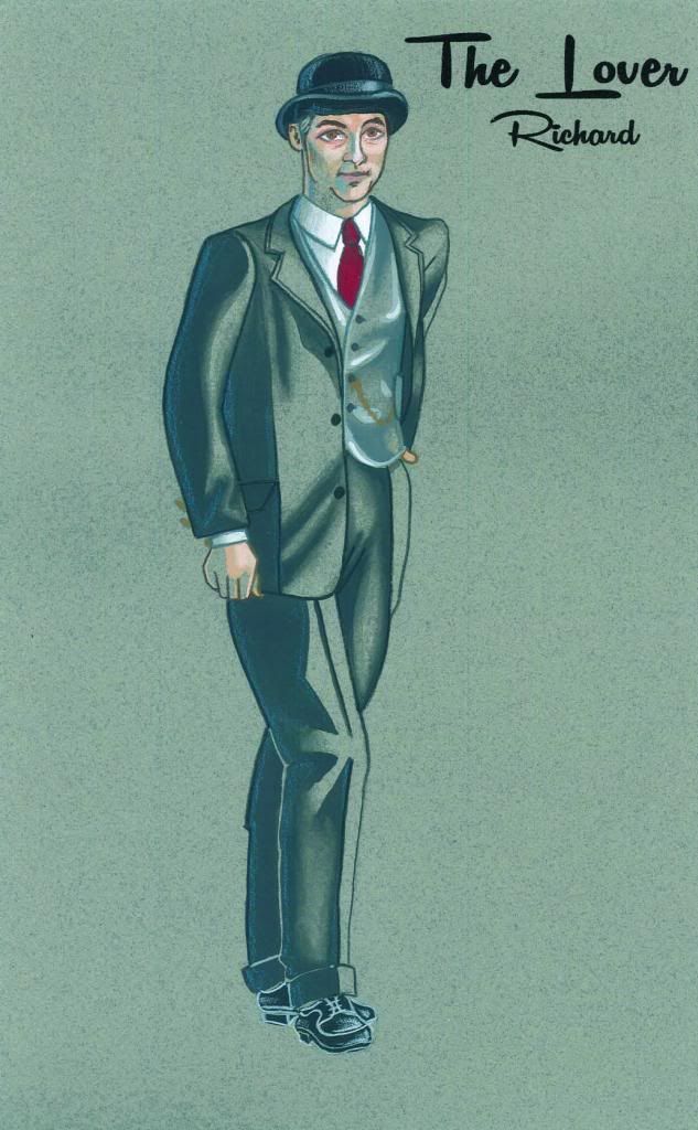
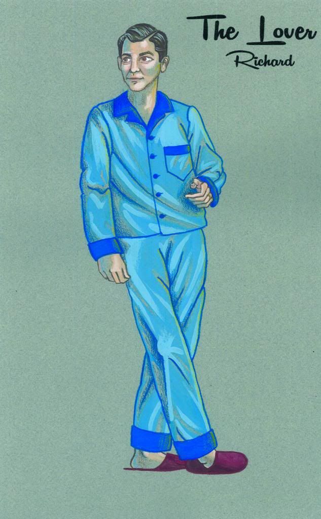
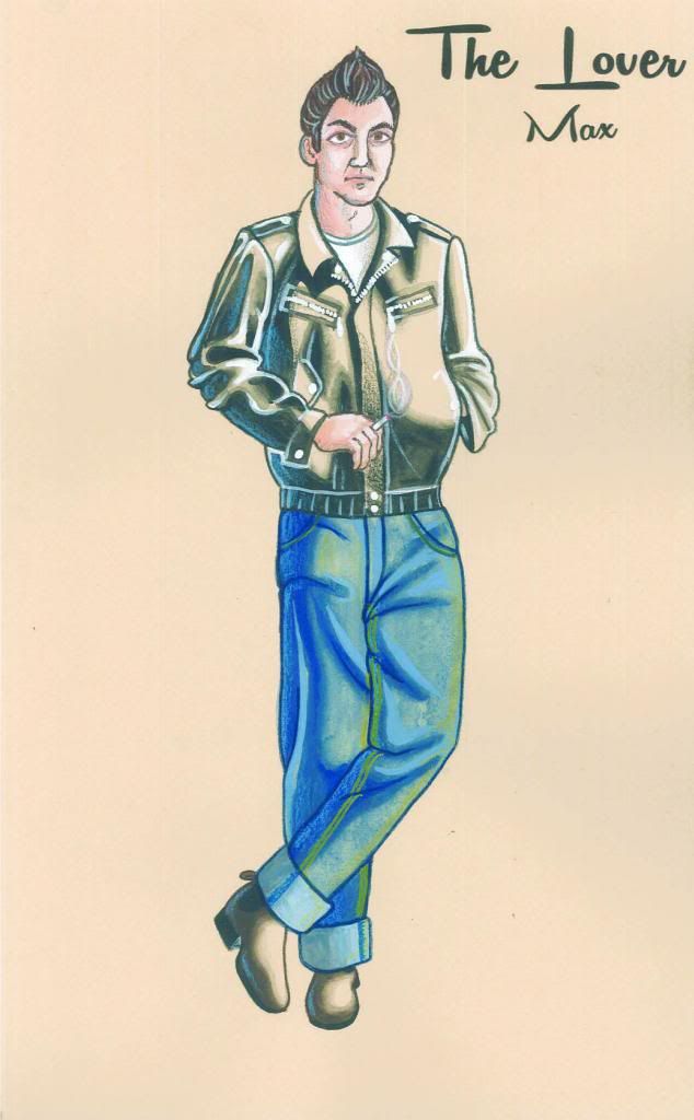
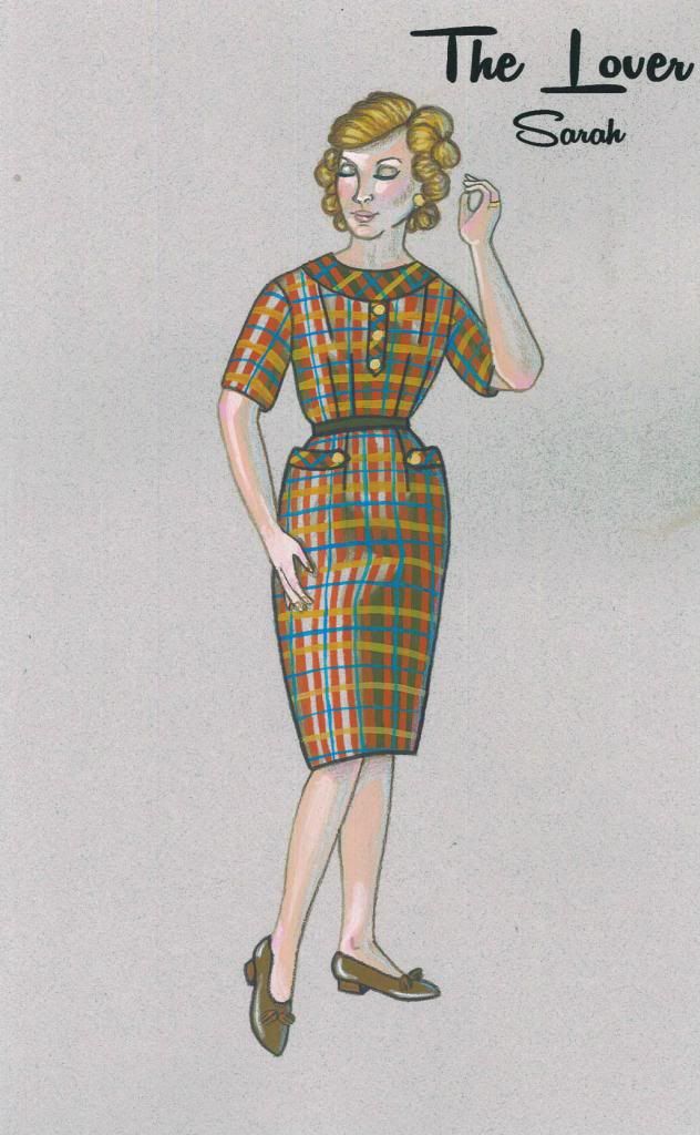
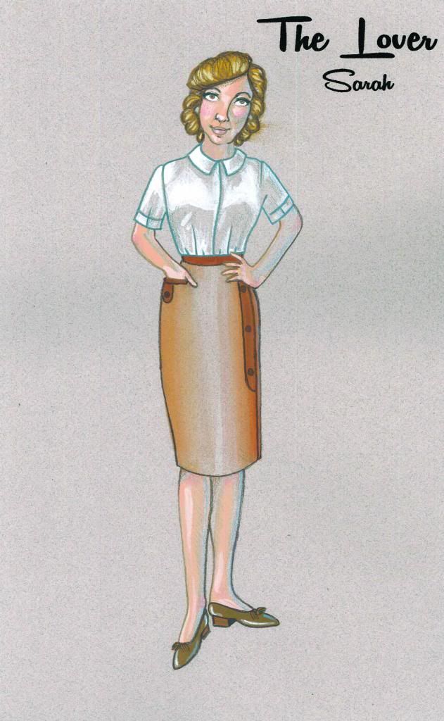
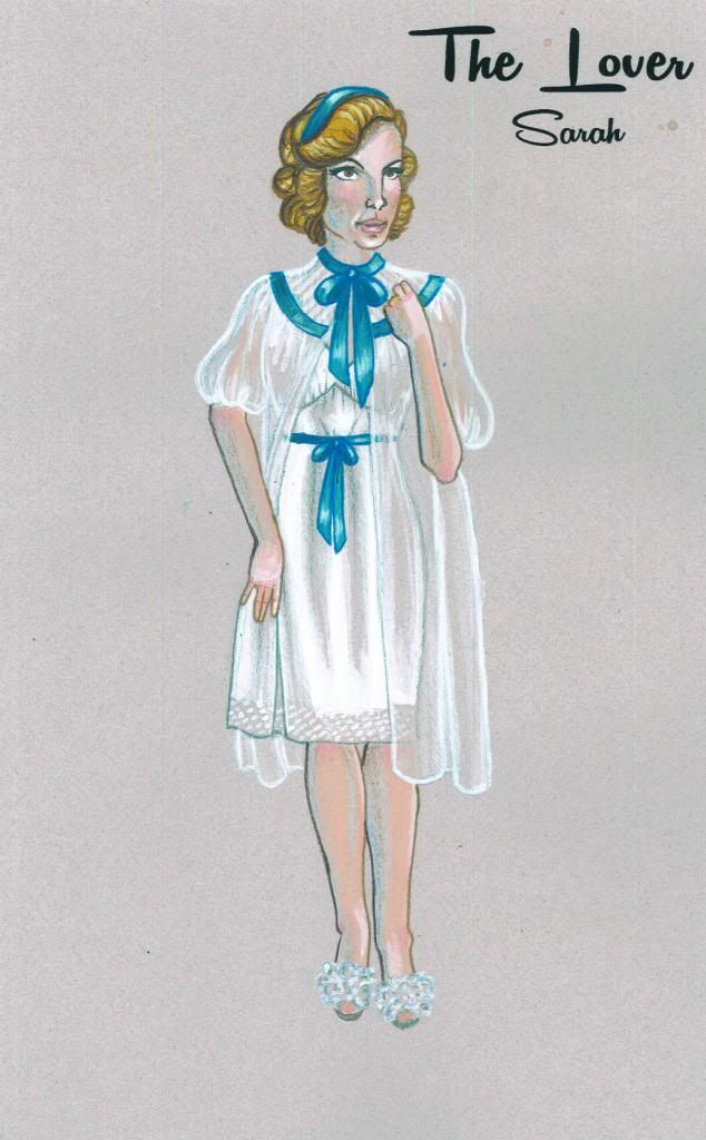
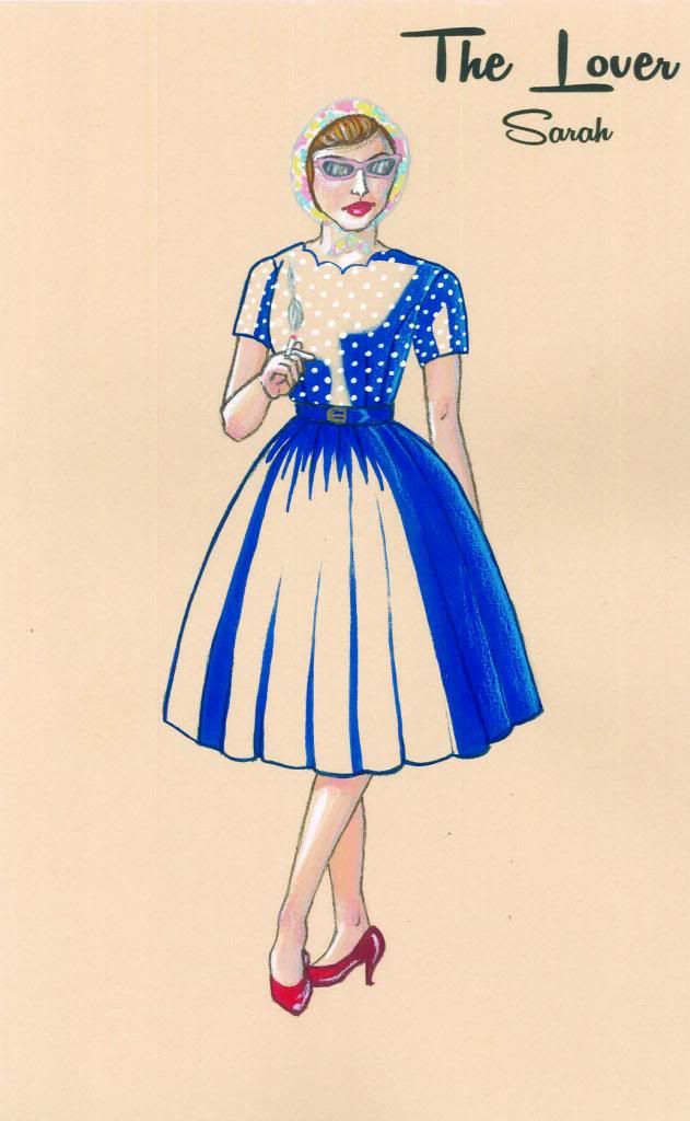
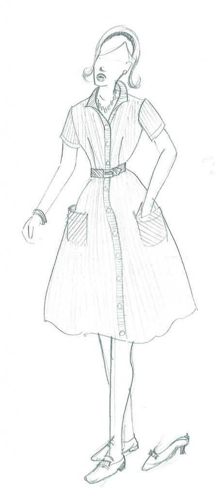
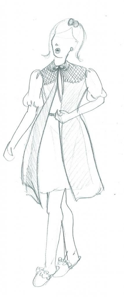
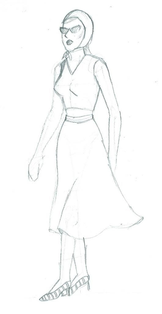
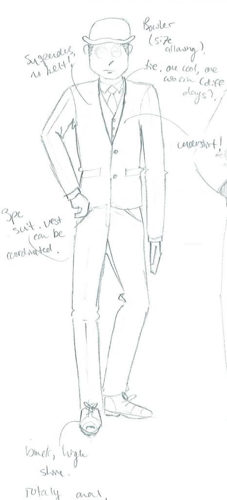
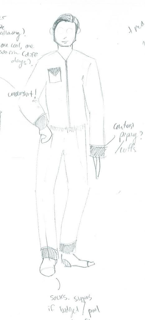
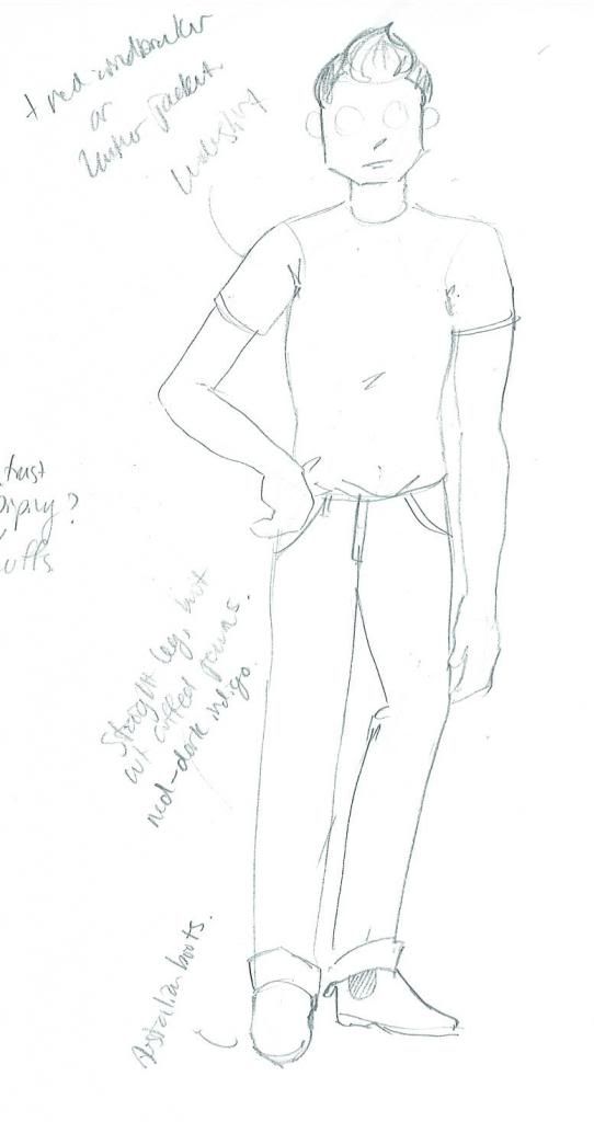
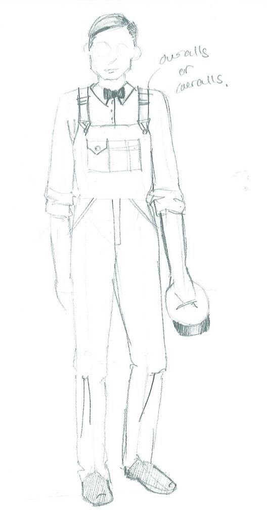
Originally created for television, Harold Pinter's The Lover was written in 1963, the same year that the production by 3 Peasants Productions (for which I am designing costumes) is being set.  We just had our first design meeting this past weekend, and I have dived into my process head first since then.  As my final designs are due in 1.5 weeks (I may have set myself a very tight deadline, eep! But sourcing costumes for a period show on a budget is going to take time, and the earlier I get approval from my Director, the sooner I can begin scouring thrift stores), I am well into the research stage of the design process.  I thought it would be fun to show you guys a peek into how I design a show at several stages in the process, from concept to creation.  So, let's see where it all begins!

I always look to the social climate of the time period the play is being set in, as well as the years leading up to it to get a real sense of what parts of the play resonate with the ongoing issues of the time.  1963 is a fabulous time to set this play, not only because it is the year it was written!  In late 1962, the "Profumo Affair" came ot light, a major scandal in British politics.  Secretary State of War, John Profumo, had an affair with Christine Keeler, reputed mistress of an alleged Soviet spy, leading to Profumo's resignation, and seriously damaging the reputation of Prime Minister Harold Macmillan's government.  In 1960, oral contraceptives ("The Pill") was made available for all married women, when it had previously only been prescribed for women with reproductive problems, as hormonal birth control treats a wide range of issues in addition to being a contraceptive.  This is a key issue with this play, where a married couple has sex several times a week and has never had children.  This is certainly something that would have occurred to the play's original audience, and is something that I'd really like to keep in mind as I work on this production: sexuality, especially in women was beginning to blossom, and those "swinging sixties" when free love reigned supreme, are just around the corner.  

In 1962-63, we're sitting just in the shift between the prevalence of the housewife (itself a backlash from WW2, as men returned home and reentered thew workforce) to the presence of the working woman, though the work roles women took were often limited at this time.  Sex, solely for pleasure and not for creating the average 2.5 children per household was on the rise with increasingly inexpensive contraceptives, and women were able to take more power in their own reproductive health.  

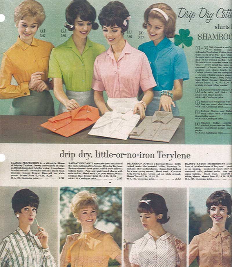
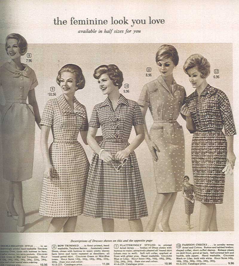
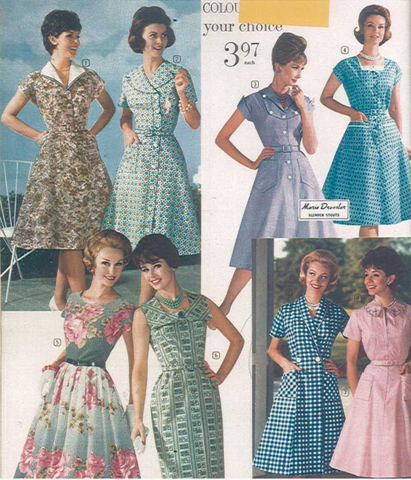
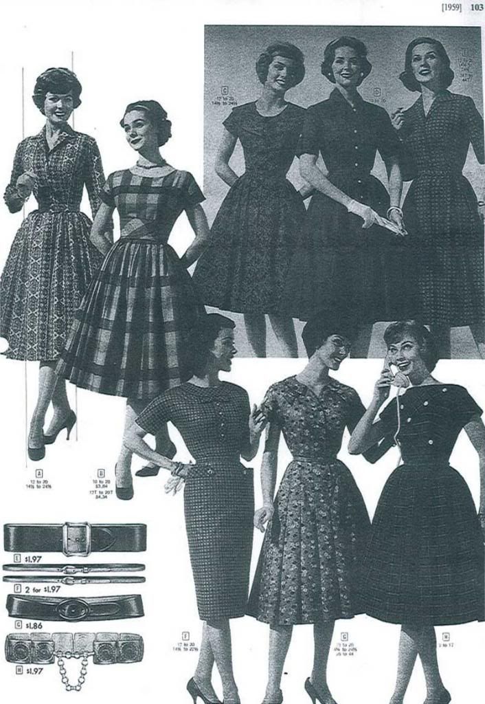
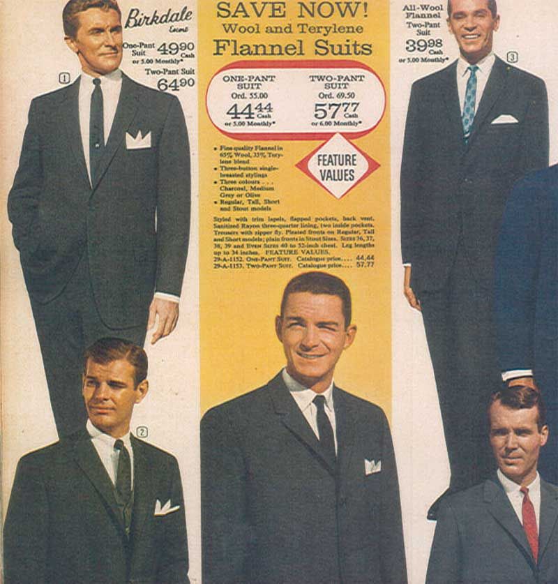
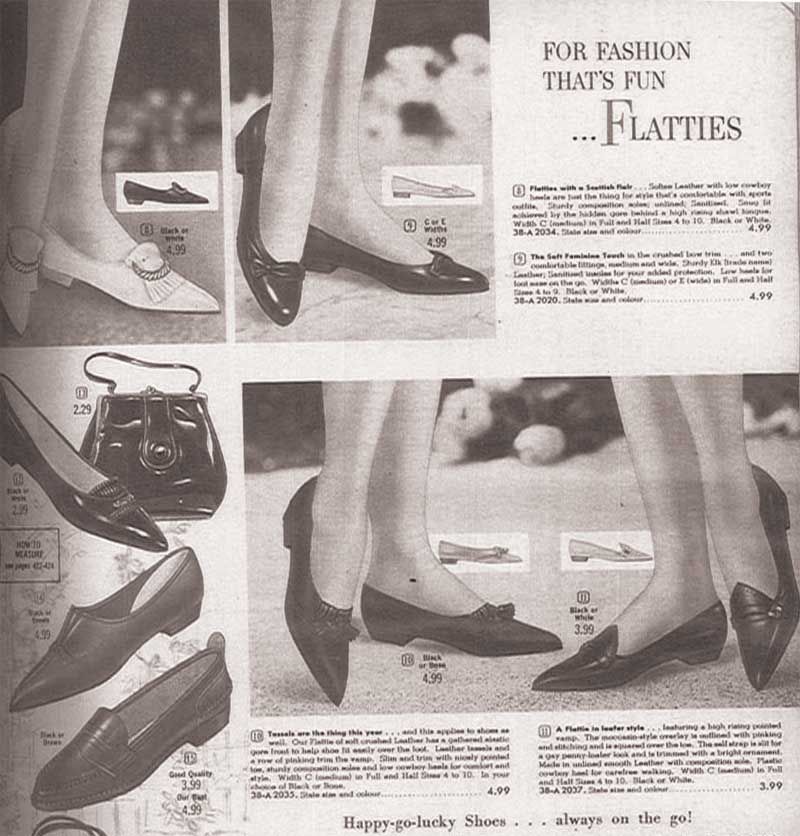
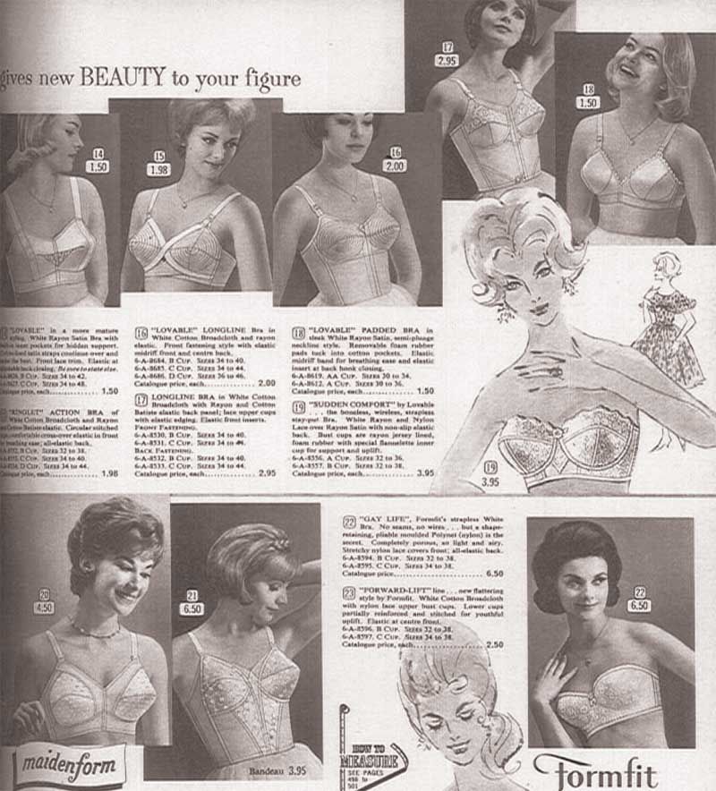
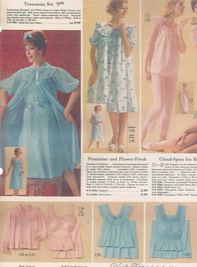
Through these social changes, fashion took a significant turn for women as well (realistically, though men's fashion does change over the years, the differences are much less marked, so we're going to focus on women here).  Hairstyles were shorter, fuller, and the youthful style of curls was replaced by upturned ends, waves and (later) sleek bobs.  Pants and flat shoes for women came into vogue, especially for the housewife: the days of vacuuming in heels and pearls were over, with more utilitarian clothing being preferred.  "Wash and Wear" fabrics and synthetics start popping up on the market, simplifying the home laundry routine, and bringing in brighter, bolder colours, and "fast fashion" - clothes made with arguably inferior materials and construction methods, making them inexpensive and resulting in fashion fads that changed frequently as clothing was viewed as more of a disposable item.  The strict rationing of materials like wool and nylon from the war was waning or lifted by this point, and the result was rampant consumerism.  Things became colourful, verging on garish, and trends in fashion and interior decorating were rapidly changing and evolving.  Also, The Beatles happened, and that shit was just cray.  So were teenage girls.  The two together were more explosive than napalm.

And we're looking at marriage in this time.  I think it could be very interesting!  I've already begun doing some quick sketches in anticipation of my Prelim deadline on Friday evening.  I'll share my prelim sketches here, and talk a bit more about the individual choices for the characters.  I'll also share some research (original Eaton's and Sears catalogs from 1957-1963 are a godsend)  to look more closely (and even in colour) at the incredible shifts in style through these years, and what this meant for women, including women like Sarah.

So stay tuned, and watch this show develop before your very eyes, before we open at the end of July!  

--Erin

PS. if you want a more thorough idea of the story, there's a modern production of it on youtube, and you can watch it here.  The original TV recording is also available here.  I hope my production will be quite different!