Hi again sports fans!
It surely does feel good to have a moment
to write here again. The last two weeks have been a whirlwind, and I
mean like a destructive "it's a twistah!!!" kind, not the fun-fancy
bright lights and cotton candy kind. 12 hour work days were pretty
regular. And while it always feels good to be busy, that was really, really
busy. But now the final designs have been handed in and approved, and I
can catch you all up in this behind-the-scenes look into my design process.
The other week we talked a lot about the play, and the political and social context of the time in which it was written, which is always important to consider when staging a production. After all, theatre is a mirror of society, or some fancy-pants junk like that. In this case, it really really is.
Okay, so we know the where, the when, and the why of the play, now what does it look like?!
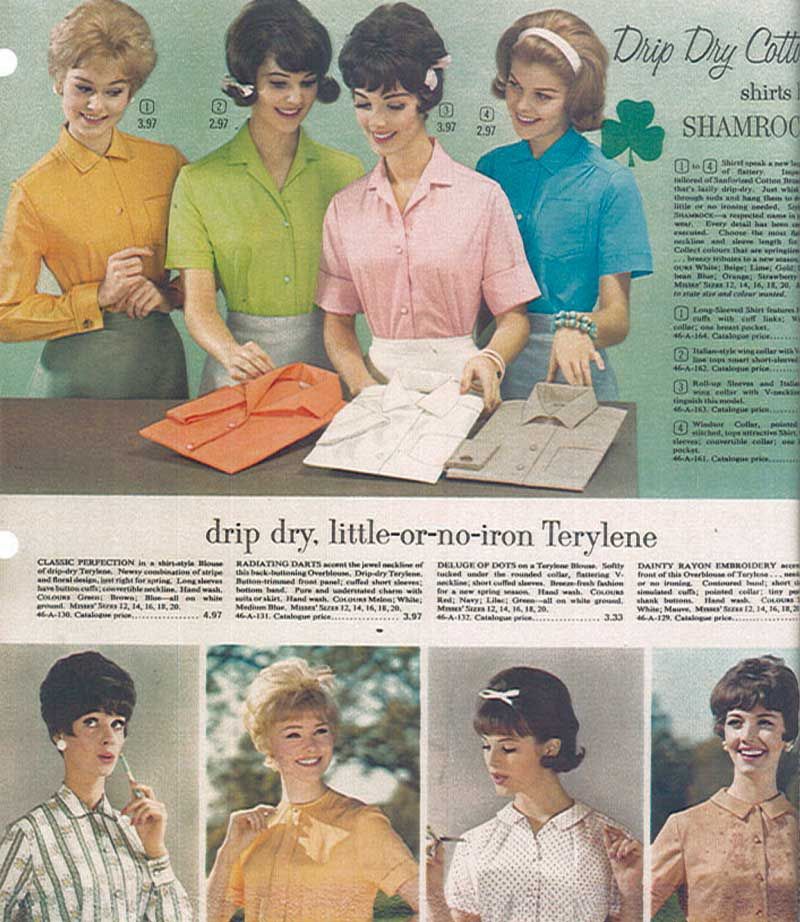
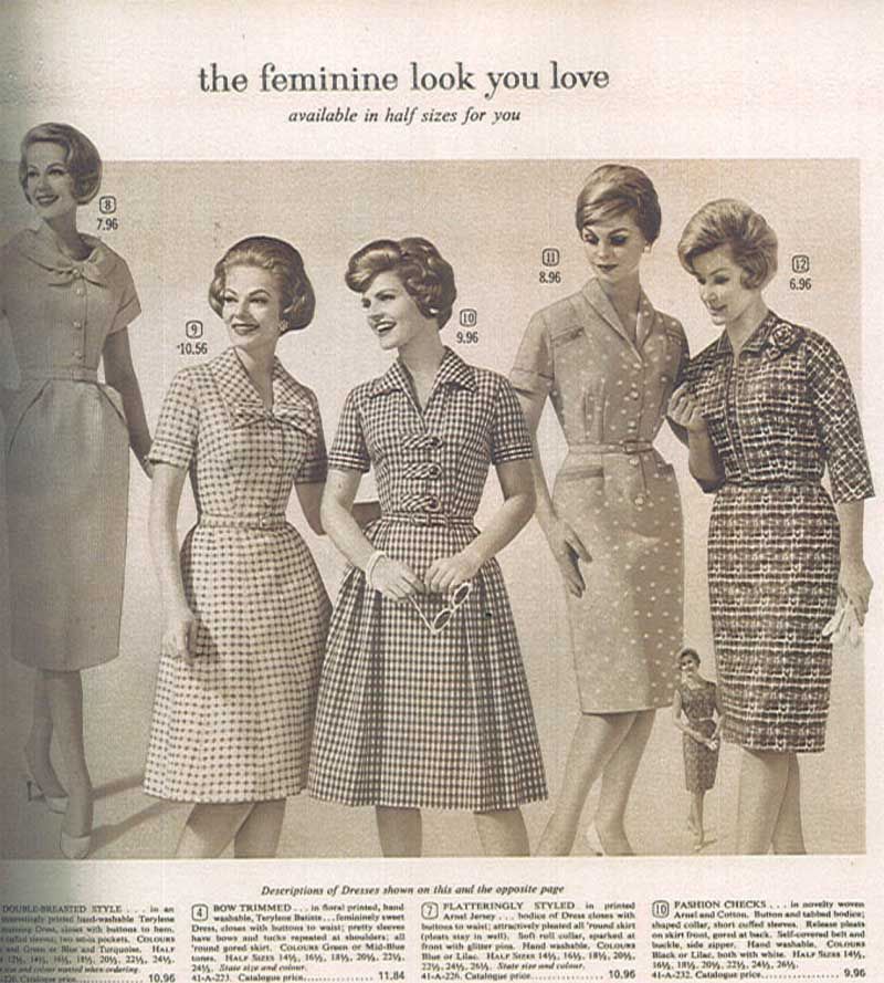
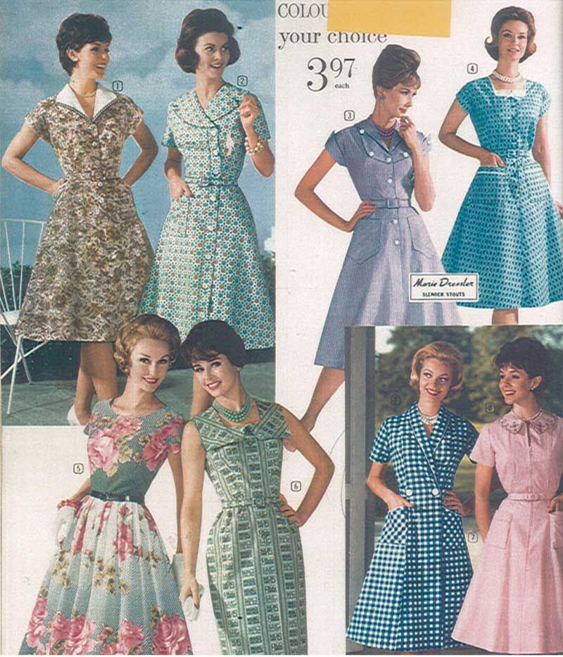
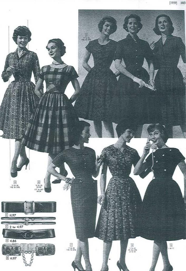
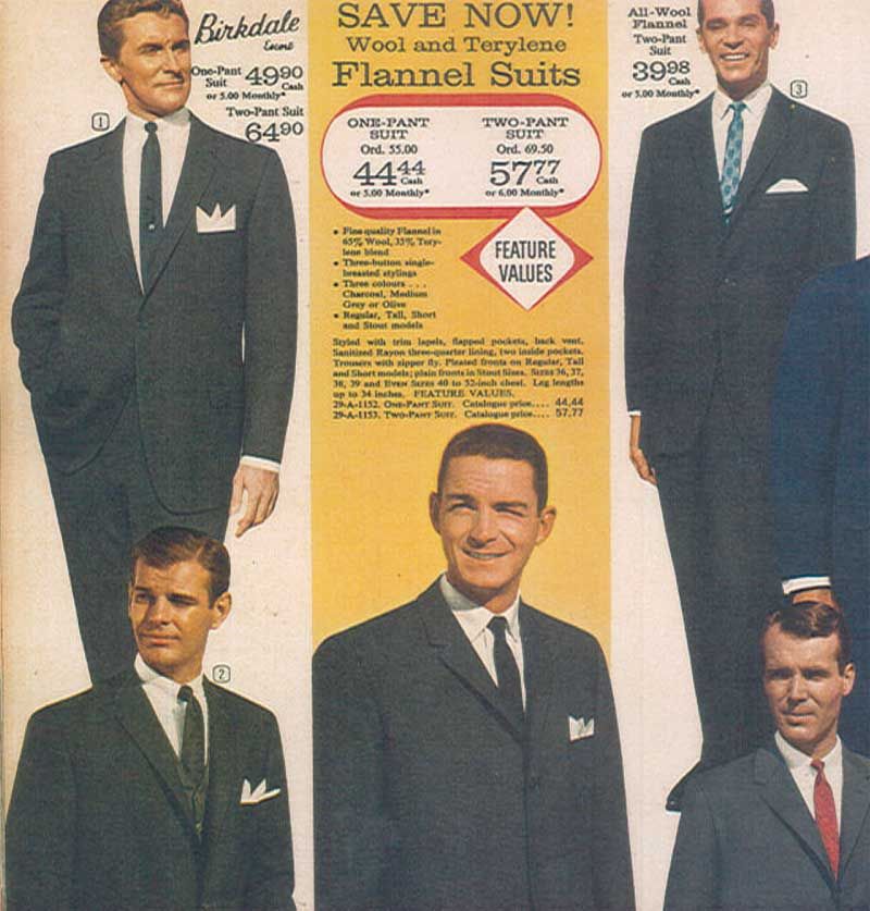
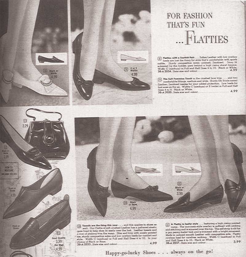
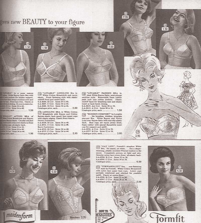
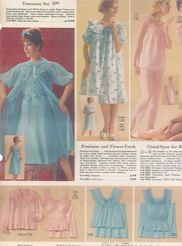
Now, my friends, comes my very favourite part of designing a show, the visual research! I'm lucky enough to work at a theatre company with extensive resources, and managed to find Eaton's and Sears catalogs for Spring/Summer from 1957-1963, to get an idea of the evolution of style (most notable in women, particularly their hair! Biiiig changes took place then!) in the years leading up to and including the year the show is being set in (and was first performed).
Now, these images really speak for themselves, so let's let them. Enjoy some of the images I used to inspire and inform my design!



No comments:
Post a Comment
Thanks for taking the time to leave a comment. I love answering questions (comments, concerns, the works!) so check back sometime for a reply! :)